draax.nl•project•various•various logos
- draax.nl•project•various•various logos
Logo - paxtrax
logo for the label of Paxy Dragon, one of the bands i was in.
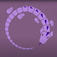
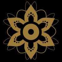
Logo - Gunnmol
logo for the rockband Gunnmol – that is, it is supposed to work as a sign for the cult around it.
Logo - Chajes letter brand
letter brand for Job Chajes, composer
Logo - De Inktpodcast
logo for ‘de Inktpodcast’ – a surrealist storytelling podcast by Patrick Bassant.
other - Dialogue / Iguana
Dialogue’s Jan Jaap Snellen, also the initiator of Studio Blackbird, where i produce all my music, asked me to make a ‘moving illustration’ as a videoclip for their single ‘Iguana’. This was a lot of fun to do. I wanted to catch the vibe of the music with a single illustration with minimal moves, fitting the style of the music.
Poster - Please Don’t Stop The Music poster
Poster (and logo) for Please Don’t Stop The Music, an initiative by Andries van Wieren, to help Dutch music acts through the Covid-19 period. Peter Hordijk (who also built this site) and I worked overnight to launch the site just the morning after we got the assignment.
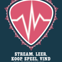
Logo - Please Don’t Stop The Music
Logo (and poster) for ‘please Don’t Stop the Music’ – an initiative to help Dutch musicians through the Covid-19 pandemic. You can also visit the site peter Hordijk (who also built this site) and I designed here
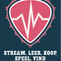
Logo - logo don’t stop the music
Logo for ‘Please Don’t Stop The Music’, an initiative to help Dutch music artists through the Corona pandemic. (https://pleasedontstopthemusic.nl/)
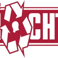
Logo - De Schlachterij
De Schlachterij was a shop in Heerenveen, Friesland, selling local quality products. I don’t think they made it but nonetheless, logo’s here to stay!
Logo - logo
Logo for the Norwegian band ‘Fint Fransk Orkester’ based on the Norwegian tradition of ‘Rosepainting’ but then in a more French Fin du Siècle style.

Logo - Floor van Dijck
logo for copy writer Floor van Dijck
Logo - Hayemo
Hayemo is the logo for my accountant. He is very secure and very helpful and always finds the detailed ways to get me through the tax situations.
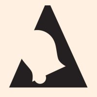
Logo - Fryslan
logo indicating ‘Frysian quality’. It could be used three ways, depending on what it needed to be printed on. There was an option with the whole word ‘Fryslan’, or just the A with the bell, or just the bell. I tried to make the physical identity so strong that, had you seen the word version of the logo, you’d recognise it if you saw only the bell.
The bell is borrowed from a frysian phenomenon called a ‘Klokkenstoel’, a tower with a bell made by farmers who were too poor to build a church but need a place for their ceremonies. It therefore has a social connotation and stands for the solidarity amongst the frysians. In the old times, they got the copper bell imported from Amsterdam, so there was also a connection with Amsterdam in this logo, which was something my client Anne Douwe liked very much.
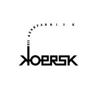
Logo - Koersk
logo for friesian thinktank ‘Koersk’
Logo - 3d of june
3d of june was a bookings agent. I designed to logo and the website – but they stopped business. Not causal.


