Dialoque clip
low animation clip for Dialoque
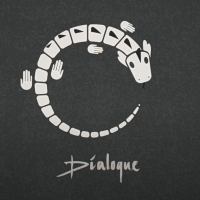
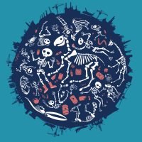
other - Dialogue / Iguana
Dialogue’s Jan Jaap Snellen, also the initiator of Studio Blackbird, where i produce all my music, asked me to make a ‘moving illustration’ as a videoclip for their single ‘Iguana’. This was a lot of fun to do. I wanted to catch the vibe of the music with a single illustration with minimal moves, fitting the style of the music.
Moving graphic design - background for little sister
This is a moving background for the animated Vlogger Little Sister.
Poster - Please Don’t Stop The Music poster
Poster (and logo) for Please Don’t Stop The Music, an initiative by Andries van Wieren, to help Dutch music acts through the Covid-19 period. Peter Hordijk (who also built this site) and I worked overnight to launch the site just the morning after we got the assignment.
Poster - No Undo
Poster - Don’t Stop The Music
Poster for ‘Don’t Stop The Music’, an initiatief by Andries van Wieren and 3S music to help Dutch bands and music artists in times of the Corona pandemic.
‘Don’t stop the Music’ is a site where you can hear Dutch artists, listen to their music, buy their records and services, mostly as music teachers or coaches. It had to be realised over night, and Peter Hordijk, who built the site (and this site, too) and i had to work pretty hard. But with effect, i like to think!
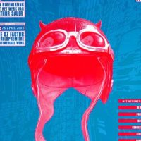
Poster - Arthur Sauer
poster for an evening with live music by Arthur Sauer. The poster refers to the notion that he wanted to be a motor crosser as a kid and now he became a composer – the music gave him the same energy and to most it sounds like motor crossing.
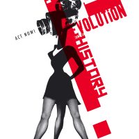
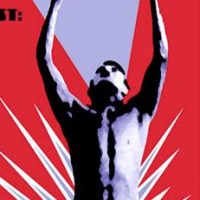
Poster - Revolution
silk printed poster (autonomous work).
‘In the future, the revolution will be history, so act now’
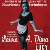
Poster - The Spinshots featuring Laura A Dima
Poster to promote the show of the Spinshots at the yearly ‘Haarlem Comic Days’. Laura A Dima did a go go dance on stage dressed as my character ‘Lucy the Home Made Maid’
Poster - Menschen Am Sonntag
Poster for an event where The Alliage Orkest played a live soundtrack to the 1929’s film ‘Menschen Am Sonntag’, which was restored and projected. For this poster, we scanned a 32 mm still from the film and blew it up.
Poster - Shot in the Dark
Poster for the event I organised with Patrick Moonen: once a month we had acts, dinner and dj’s in a circus tent.
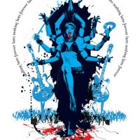
Poster - Kali Maya
Poster (autonomous work) with Kali – stating ‘Nothing lasts Forever’. I called this poster ‘Kali Maya because Maya posed for it and ‘Maya’ means the ‘veil between us and reality’. The poster is silk printed by hand in 5 colours and is 1.20 cm high.
If you want to buy a print (there are two left) mail me!
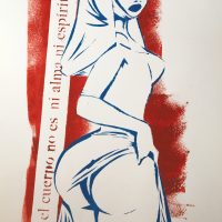
Painting - El cuerpo
The body is not the soul is not the spirit, says the nun.
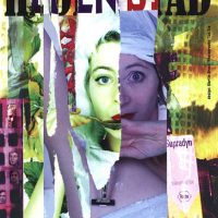
Poster - heden Stad
Poster for Hotel Modern. I wanted to emphasise the loneliness one can have living in a city: the feeling that ‘much is happening, but you’re not part of it’ can be heavy, especially for young people. So i asked photographer Tza Tza to make these pictures of the actors and i ripped the prints into this poster.
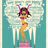
Poster - Amsterdam Beat Club NYE party
Poster and flyer for Amsterdam Beat Club, a ’50s/’60s oriented club night with bands, dancers, acts and deejays.
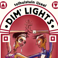
Poster - Dim’ Lights
Dim’ lights was an event for people who love dancing but hate electronic beats: that’s me!!! I loved to do this poster.
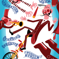
Poster - circus poster
Poster for a circus. I’d love to get more assignments for which i can use this style of drawing! Drop me a line!
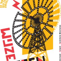
Poster - Wijze Lessen
This is a silk printed design; in fact, not a poster but the world’s biggest business card. i made it for a philosopher who brought talents together.
‘Je moet niet denken dat een ander denkt zoals jij denkt’ means ‘you should not think someone else thinks the way you do’, and ‘Wijze Lessen’ means ‘Wise Lessons’ (if this is even English). I thought my client was a person crying in the wilderness: loud, with good ideas but unheard by policy makers. So i made a huge business card for him: it is one meter high and about 65 cm wide.
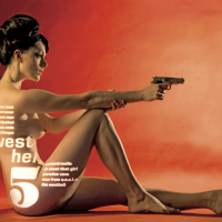
Poster - West Hell Five poster
Poster for the Amsterdam based spy fi band ‘West Hell Five. The photo was made by Myrthe ter Maten, the model is Marieke Bos. The typography is projected on the model so i had this sketched out very carefully and the model had muscle strains the next day. It never ceases to amaze me how unnatural models must bend their bodies to occur natural on photos.
on the back site of the poster is a novelle written by drummer Wilf Plum. I did the typography of the story on seemingly torn pages from a book with a hole in it to hide a gun.
Set design - Friesland carpet
At the Rabobank in Heerenveen, a 10 floor high building, there obviously was a top floor. My client Anne Douwe Knobbe wanted a ‘place for philosophers’ on that spot and he pulled it off to get a free pass to experiment from the director. Anne Douwe asked me to design a 16 meters long carpet (produced in east Germany with 6 inks and transported to Heerenveen) and i made a map showing the connections between Heerenveen and places of influence. Note the ‘bell’ logo i also designed for ‘Frysian Quality’.
The carpet was laid on the ground and stuck to the walls, and the dark part was for projections during speeches. The light part had a meeting table designed by Flat Architects.
Photos by Arend Loerts.
Record sleeve - West Hell Five
Artwork for West Hell Five, an Amsterdam based spy fi jazz combo. The photo is made by Mirte Ter Maten and to keep it real, the title is, James Bond style, projected on the girl. No photoshop here peeps. (well the photographer obviously did some colour correction)
Inside was a gigantic poster of the lady with the gun. On the back side of that poster we see a spy fi novel drummer Wilf Plum wrote on pages ripped from a book. The book has a hole in the middle hiding a gun.
Record sleeve - Gainsnord
Gainsnord is an initiative of the Dutch DJ Guuzbourg, who coined the term ‘Zuchtmeisjes’. He asked several Dutch bands to make a cover of a Gainsbourg song – the Spinshots chose ‘Qui Est ‘In’, Qui est ‘Out’, which became the single of the album.
For this record i had the honour to work with Dutch well known comic artist Hanco Kolk, who made the beautiful portait of Serge for the cover.
Record sleeve - gainsnorth
When Guuzbourg asked the Spinshots to contribute a song to the cover-album ‘Gainshorth’, a tribute to Serge Gainsbourg, he also asked me to do the design for the records. That is, our single and the album itself. He already asked Hanco Kolk for the artwork, so I could work with one of the greatest comic artists the Netherlands have to offer.
Record sleeve - nasmak sleeve
Nasmak was a band that made lots of demo tapes on cassettes somewhere in the 80s. When they brought out these tapes in 2019 (!) Joop van Brakel asked me to do the sleeve design. I loved what they made and did the design like i would have done in the 80s: with a typewriter, punaises and glue. The cover is just a photo, everything is really glued and pricked there.
The cover illustration with the meat flag is made by the illustrious band member Joop van Brakel, in co-operation with Rembrandt.
other - Dialogue / Iguana
Dialogue’s Jan Jaap Snellen, also the initiator of Studio Blackbird, where i produce all my music, asked me to make a ‘moving illustration’ as a videoclip for their single ‘Iguana’. This was a lot of fun to do. I wanted to catch the vibe of the music with a single illustration with minimal moves, fitting the style of the music.
Poster - Please Don’t Stop The Music poster
Poster (and logo) for Please Don’t Stop The Music, an initiative by Andries van Wieren, to help Dutch music acts through the Covid-19 period. Peter Hordijk (who also built this site) and I worked overnight to launch the site just the morning after we got the assignment.
Logo - Fryslan
logo indicating ‘Frysian quality’. It could be used three ways, depending on what it needed to be printed on. There was an option with the whole word ‘Fryslan’, or just the A with the bell, or just the bell. I tried to make the physical identity so strong that, had you seen the word version of the logo, you’d recognise it if you saw only the bell.
The bell is borrowed from a frysian phenomenon called a ‘Klokkenstoel’, a tower with a bell made by farmers who were too poor to build a church but need a place for their ceremonies. It therefore has a social connotation and stands for the solidarity amongst the frysians. In the old times, they got the copper bell imported from Amsterdam, so there was also a connection with Amsterdam in this logo, which was something my client Anne Douwe liked very much.
Poster - Please Don’t Stop The Music poster
Poster (and logo) for Please Don’t Stop The Music, an initiative by Andries van Wieren, to help Dutch music acts through the Covid-19 period. Peter Hordijk (who also built this site) and I worked overnight to launch the site just the morning after we got the assignment.
the spinshots live registration - The Spinshots with Comic Sexy at the haarlem comic festival
Haarlem Comic Festival asked the Spinshots to perform live and have a fashion show with Comic Sexy. We had a very nice stage and dancers in the dresses: the dancers were drawn by a comic artist at the spot.
These photos were made by Thijs Tennekes.
Logo - exotica
With the Spinshots, our music styles varied too much to be easily bookable. We decided to start our own booking agency and this was the logo. i mad this with stuff that i had lying around in the house, i actually have a special room for assemblages and styling objects called ‘the treasure room’ – and this could be made in one day!
animated scene - Marlon, Chapter 16
One of the brighter kids I had the pleasure of teaching at art school was Marlon, who was in transition and wrote a book about his previous life. Not only was he bright, he also was very sad to hear that I would not agree on this book being his examination work for art school. Then he made a smart move: he ‘directed’ a movie for which he asked al kinds of people, mostly criticasters to show how the work is done and made it one of his examination stunts to present a very long lasting movie about his life, seen through other people’s eyes. It was a bit of a stunt, and I think it was more ‘producing’ than ‘directing’ but conceptually i thought it was a strong idea.
So I had to make this in a few hours: choosing one of the chapters from his book and turn it into a visual. Smart ass. i hope they are doing great, out there.
Oh I wrote the music too – played by the Spinshots.
the spinshots live registration - Comic sexy with the Spinshots at Paradiso
Ir Vendermeulen, the ‘Godfather of Amsterdam’ and initiator of the Amsterdam Beat Club, asked me to perform with the Spinshots and create a fashion show with the models presenting the designs while the band backed them up live.
This all happened at Paradiso, the rock temple of Amsterdam.
Trailers and promo clip - Aliens Today, Sisters Tomorrow
Part of the fun of making promotional art for your own brand, is the freedom with which you can do so. I had to laugh out lout when I came up with the pay off – ‘Aliens Today, Sisters Tomorrow’ – but then again, this really reflects a concept I use more often in my work. It also reflects the MAYA principle (coined by Raymond Loewy), which shows that people are always scared of the new but we can overcome our fears by simply getting acquainted.
Heck, let’s not get philosophical now, just enjoy these nice and smart girls wearing Comic Sexy dresses and listen to the music I wrote, executed by The Spinshots.
The song ‘Balkan Dinosaur’ was written for the Spinshots, during their ‘Seven Bullets, One Gun’ period. You can here the full song here.
Poster - Don’t Stop The Music
Poster for ‘Don’t Stop The Music’, an initiatief by Andries van Wieren and 3S music to help Dutch bands and music artists in times of the Corona pandemic.
‘Don’t stop the Music’ is a site where you can hear Dutch artists, listen to their music, buy their records and services, mostly as music teachers or coaches. It had to be realised over night, and Peter Hordijk, who built the site (and this site, too) and i had to work pretty hard. But with effect, i like to think!
Graphic design (other) - Cosmopolistan
My friend Balder designed the titles for the movie ‘Dunya and Desie’ and asked me to help. The camera would pan and slide over various items that were related to the main characters and hoover over credits. I did a few things more, but the ‘Cosmopolistan’ with Flora Dolores of the Spinshots on the cover was such a funny thing to do that I thought I’d show it here.
other illustration - A Room With A View
A Room With A View originally was made for the theatre show ‘Some Kind Of Golem’ by Amsterdam klezmer Band but the song for which this work was intended needed another image during the development of the show. So now it found its home at the waiting room of the Doctor’s Office of my friend Esther.
Poster - Kali Maya
Poster (autonomous work) with Kali – stating ‘Nothing lasts Forever’. I called this poster ‘Kali Maya because Maya posed for it and ‘Maya’ means the ‘veil between us and reality’. The poster is silk printed by hand in 5 colours and is 1.20 cm high.
If you want to buy a print (there are two left) mail me!
other illustration - I Never Asked For It
Autonomous work. I used to sell hand made prints with this design. I have always found it miraculous that the stories in the Bible are so patriarchal. Is Mary really supposed to be happy to be impregnated with a child that she will survive and is not made with her consent?
various - Lucy The Home Made Maid
Luce is a character for a film I never had time to make. She is of course based on the Monster of Frankensteijn, which i thought was funny for a cut out animated figure.
Although I never made a film with her, i still toy with the plan. So far she came to life in two tests and on stage, when Laura A Dima performed as her with the Spinshots at the Haarlem Comic Festival.
comic - Police starts with testing drug labs
I forgot which short-lived magazine this was for. They asked me to do a one-page comic for each edition, reflecting on the news. News was that the police would start mobile drug test labs and I thought this would be a funny translation. Actually, I like the police officers outside, in the Dutch rainy night, the most – you can feel the crankiness, hahaha.
comic - draax in hustler
Comic in the Dutch Hustler magazine. At the time (in 2004) it tried to change itself into a left wing magazine with sex pictures – great concept – but I wasn’t asked again after the experiment of the editor in chief to ask me to draw a comic and do an interview. The storyline was written by Philippe Machin
Painting - Bull
Dani and Serge invited me to their loving home and ask me to make something for me. It could be anything, as long as it was a bull – hahaha, and I accepted. I made this bull using many layers of oil paint, each round adding a different colour to get these dark red-blood and saturated other colours. There’s blue in the black, yellow under the white.
I asked my friend Walley to make the frame: it should fit perfectly around this strange from. A frame exclusively made for this painting! We painted the backpart of the frame black and the front cakey – looks like gold because of the context of the colours. The wood is still visible everywhere, and Walley made a unique system to hang it.
Painting - white privilege
I made this painting because I believe that there is a lot of racism in not helping refugees. I am trying to use humor as a tool to reflect on our social behaviour a lot, and although this painting is very sour, I am afraid that is true that a boat of Dutch white citizens would be saved easier and without hesitation – how different is the case when a boat full of refugees from Africa.
digital still - Strength
This work was made for a group expo, for which the curator had a really cool idea: she had a pack of tarot cards and let all the artists pull a card. That was the card you had to redesign, and I had ‘strength’.
I thought a raging bull is strong, but to sleep between his horns is stronger.


