draax.nl•project•Titia Tijmstra
- draax.nl•project•Titia Tijmstra

Logo - logo Titia Tijmstra
Logo and lettermark for the copywriter Titia Tijmstra. She wanted something ‘playful’ without being a ‘loudmouth’ and she liked this ambiguous colour. I drew an abstract version of a Fuchsia and used that colour as an accent colour in her graphic identity.
For the lettermark i used the letter font Clarendon Bold and altered the serifs to make it more playful.
The graphics are part of a quirky identity with a drawn portrait on het website.
portrait - portrait Titia Tijmstra
Portrait for the graphic identity for copywriter Titia Tijmstra. We figured the site needed a portrait, but not a photograph – this illustrative portrait seems less aggressive and more playful than any photo on that place would be.
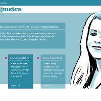
Website - website Titia Tijmstra
Homepage design for the website for copywriter Titia Tijmstra. The identity needed to be playful, without being loudmouthed. She wanted to emphasize her copywriting would be about the ‘people behind your business’ so she needed an approachable feel to the identity. We figured a drawn portrait would somehow be ‘less aggressive’ and more quirky as a first impression.
