draax.nl•project•Future Affair
- draax.nl•project•Future Affair
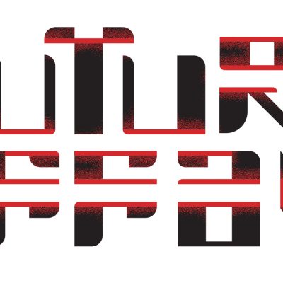
Logo - logo
For the logo of Laura A Dima’s art project ‘Future Affair’ i looked at Japanese design, vintage ‘future’ typography and i tried to put in something of the ‘electrified feel’ of the installation. The logo was stitched on lab coats that Laura’s assistants wore during the performance.
(the photo on the location is made by Maarten Nauw)
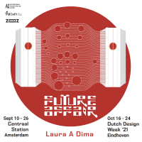
identity related - key illustration
By making a graphic illustration of the capsules visitors would be in on the art event, people could not expect this would be things they would be in: we did not want to give away too many details as the experience should be pure but the poster had to be a bit spectacular, ‘designy’ and showing the content. So this was my translation to the futuristic idea of human touch being wired between hubs.
Poster - posters
The poster for Future Affair was tricky. The work, as designed by Laura A Dima, provides a very strong image, yet we did not want to give that away. We needed a poster as a window to the content and advertising the experience, but if we would show how Laura would do that through her artwork, we felt we were downgrading the work. So i designed something with an illustration, almost an infographic about physical ‘touch’ (of the hand) being wired from one capsule to another.
The artwork explained in short: a luring sculpture in one hub wires data to the other hub when touched. In the other hub, a machine is triggered to caress the visitor sitting there through a machine. This project caught the attention of the Technical University as well as social scientists as you don’t see who you are caressing. The artwork brings ‘communication’ to a basic level, a level we feel all comfortable with – yet we do things we would not do if we would have seen the other person.
