draax.nl•project•fort aan de klop
- draax.nl•project•fort aan de klop
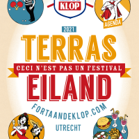
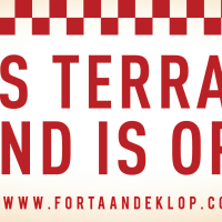
Poster - terras eiland
Poster for Fort aan de Klop, ‘the nicest island on mainland’.
During the corona crisis there was a moment they could re open their terrace, as long as people were sitting one and a half meter apart. They made sure there was plenty of entertainment and this is the poster for it.
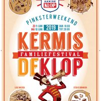
Poster - Kermis De Klop poster
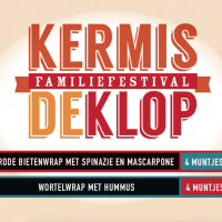
identity item - kermis de klop things
various identity items for the family festival ‘Kermis de Klop’ in Utrecht, The Netherlands.
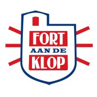
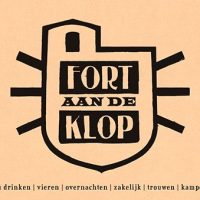
Logo - logo Fort aan de Klop
Logo for Fort aan de Klop. They wanted to express the coolness of working with local (Dutch) products (check the colours of the Dutch flag! Who would have ever thought i’d use those! But hey, it’s subtle isn’t it?) and well, they are in this unique place, a sort of mix between a fortress and a bunker.
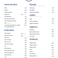
identity item - menu card
the menu card of Fort aan de klop
banner - ons terras is open
When the Dutch Government decided to loosen up the Corona rules a bit, Fort aan de Klop had to communicate that their terrace was open, as long as guests sat one and a half meter apart. I designed this banner (it’s 3 meters wide) for their garden – people could see this when they had a stroll in the neighbourhood.
Note that the waiter is the same guy as the director of the circus presented at the festival ‘Kermis de Klop’ – we made a character out of him that returns on several occasions.
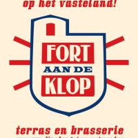
identity item - identity Fort aan de Klop
For the family event playground ‘Fort aan de Klop’ in Utrecht, i developed an identity that now is in use for more than 15 years. They sort of specialise in ‘good local food’ and a friendly, non-city like environment in the midst of the city. Frequently, there are bands and theatre groups playing, and they organise festivals.
i designed their logo and graphic identity.
Poster - Het Mooiste Eiland Van Het Vasteland
This was a poster to advertise for ‘The Nicest Island On Main Land’ in Utrecht, a Dutch city.

Poster - Kinderkunst festival
poster for the ‘kids festival at Fort aan de Klop
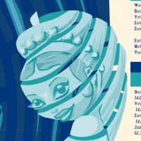
Poster - Ariadne
Poster for the theatre show ‘Ariadne at Fort aan de Klop in Utrecht, the Netherlands.


