draax.nl•project•Amsterdam Klezmer Band•25 years
- draax.nl•project•Amsterdam Klezmer Band•25 years

Logo - 25 years AKB
Logo for ’25 years of AKB’ – only for big use. i made variations for small use – but personally i like the one with the cirles that become a star most. It’s based on the idea of the rings of a tree: the 7 individuals of the band together make the star, the heart of the band and they exist for 25 years – so there are 25 rings.
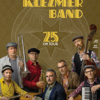
Poster - tour poster
For their tour celebrating 25 years of the band, i got a promotion photo to work with. It was a bit hard for me because usually i design from scratch and if needed, ask a photographer to picture something specific. But the photographer was smart and left a big playfield open for typography and the graphic i designed: 25 rings meaning 25 years, a circle being a star at hart symbolising the synergy of 7 individuals coming together in a band. I also loved it that we could keep it very basic: hold your phone close to the code and book a ticket – that is about all information!
Because they look a bit like people from bygone times i thought the typography should also resemble 1921, rather than 2021. The whole thing fits their music well: traditional and contemporary at the same time.
The photo is made by Tessa Posthuma de Boer.


