draax.nl•project•Amsterdam Klezmer Band
- draax.nl•project•Amsterdam Klezmer Band
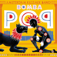
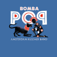
Record sleeve - Bomba Pop Album design
‘Bomba Pop’ is the name of the 2024 album by Amsterdam Klezmer Band. We came up with the name after a brainstorm with Gijs (Trumpet) and Jasper (Bass) in which they explained that they had to break a lot of their material to pieces, in order to get this progressive, new sound. We decided the album was about breaking that what you love, in order to become better.
So i translated that into the Greek / Etrusk habit to paint their heroes on vases: everyday (breakable) objects used as canvases for art and storytelling. Not unlike an LP, I thought. So the imagery is based on Greek mythology and the popular outlook of Greek ancient art, but with new imagery. On the cover we see a modern day Hercules with a lion. Has he tamed the lion? Are they friends? Is this a ritual before a fight? In the back we see the city wall of Hamburg, since this album is produced by Dunkelbunt, who is from there.
We also felt an urge to communicate through the imagery the main focus of the band: to connect people of all backgrounds. This album came out in a heavy time and the band wanted to communicate (although not too obvious) that they were above tribalism: they’d connect everybody. They make people feel good. Hence the dove: the album came out in 2024, after all.
The photo of the band is made by René Nuijgen.
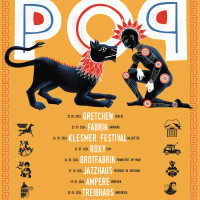
Poster - Bomba Pop posters

Graphic design (other) - promotion shards
Since the concept op the album ‘Bomba Pop’ is ‘breaking what you love to become better’ we had the band dancing on plates and cups, breaking the stuff while doing a wild Sirtaki. Photographer René Nuijens found a perfect location for the publicity photo and we gathered the shards to make businesscards to promote the album on music professionals fairs.
click here for the album design and the identity images of the singles
teeshirt - Bomba Pop Teeshirt
Teeshirt for the Bomba Pop period. We also had yellow ones for the band.
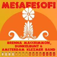
Record sleeve - Mesafesofi
Mesafesofi is the fourth single taken from the album ‘Bomba Pop’

Record sleeve - Fire
Cover for the third single of Bomba Pop.
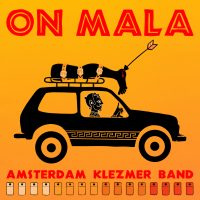
Record sleeve - On Mala
‘BOn Mala’ is an album by Amsterdam Klezmer band, released in 1023. I was asked to design the identity for that period: the album, the singles, the posters and the visual concepts. This cover is of one of the singles, and has the name ‘On Mala’.
‘On Mala’ tells the story of a man going to war after being promised a Lada by his government. He gets back from the war missing a leg and therefore can’t use the acceleration pedal of his new car.
The identity concept boils down to ‘to break what you love in order to make it better’. The images on the covers and posters are inspired by the ancient Greek and Etrusk vases. Everyday (but breakable) objects depicting heroes and their actions. I replaced ‘vases’ by ‘albums’ and ‘singles’ and made an iconography inspired by Greek mythology but linked to the songs by Amsterdam Klezmer Band.
We see a guy driving a Lada with a leg on the roof of his car. The arrow indicates it’s Achilles’ leg, so the guy driving the car must be Paris – who apparrently also was given a Lada by his government.
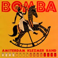
Record sleeve - Bomba
‘Bomba Pop’ is an album by Amsterdam Klezmer band, released in 1023. I was asked to design the identity for that period: the album, the singles, the posters and the visual concepts. This cover is of one of the singles, and has the name ‘Bomba’.
‘Bomba’ tells the story of a man lusting for a woman who later ruins his life.
The identity concept boils down to ‘to break what you love in order to make it better’. The images on the covers and posters are inspired by the ancient Greek and Etrusk vases. Everyday (but breakable) objects depicting heroes and their actions. I replaced ‘vases’ by ‘albums’ and ‘singles’ and made an iconography inspired by Greek mythology but linked to the songs by Amsterdam Klezmer Band.
So here we see a girl based on Helen of Troy acting as a femme fatale riding a rocking horse full of wine at a wild party – fitting the atmosphere of the music. The fun is dat this kind of icons are very good for minimal animation: for the promotion i made a moving version as a gif and as a printed lenticular card.
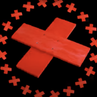
leader or bumper - Club Amsterdam Klezmer Leader
When the COVID-19 crisis started, Club Amsterdam Klezmer went online. It was a mix of live gigs broadcasted through internet and interviews through Zoom – and it needed an identity. i made the graphic design, stationcalls and other moving graphics.
I wanted to emphasize the ‘self made’ but oh-so Amsterdam based character of the band. The Amsterdam logo consists of three red crosses on top of each other on a black background, so I took some pieces of wood and made an animation featuring a home made cross.

leader or bumper - Club Amsterdam Klezmer Online bumper 3

leader or bumper - Club Amsterdam Klezmer Online bumper 2
leader or bumper - Club Amsterdam Klezmer Online bumper 1
Website - Klezmer Academy Website
webdesign for Amsterdam Klezmer Band: the Klezmer Academy. As soon as the site is online, I’ll give you the link! Built by web hero Peter Hordijk, who also built this site.
Book(let) - Klezmer Academy book
Book for studying songs by Amsterdam Klezmer Band – in four sections: for C instruments, Bb instruments, bass instruments and Eb instruments. The inside design is executed largely by Gijs Levelt, who understands musical notation like no other and gave it all his energy and love.
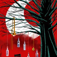
other illustration - aunt peppie
Aunt Peppie is the opening song of the show. Dick and i thought it would be good to sort of give hints to what is coming. Even the moon and the chair are hints. Of course, the picture on this site is too small to see it, but in the bottles are a lamp, a paper boat floating on water, a letter, soap and a rat’s skeleton.
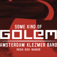
Poster - theatrical poster
Theatrical poster for ‘Some Kind Of Golem’ by Amsterdam Klezmer Band
other illustration - Power Cut
Power Cut tells the story of the band playing on a festival where the electrified sound was very bad. They played and played but the sound was horrible and too loud. Then there was a power cut and they played acoustically, unamplified. Suddenly, everybody was dancing and their gig was a great success. I visualised the power cut as if caused by a rat eating a cable in the PA system.
other illustration - Op de Brug
Op de Brug ia s song written by Jasper de Beer about how the Amsterdam Klezmer Band met. Dick Hauser, the director of the theatre show Some Kind Of Golem associated the story with James Ensor’s painting ‘L’Entrée du Christ à Bruxelles’ and i thought it would be nice to put figures from that painting on an Amsterdam bridge welcoming the band.
other illustration - Mooitje
This is an illustration coming with a song by Gijs Levelt about the cavias of his children, Although they look cartoony, they really are drawn after the likeliness of the two pets. The idea came from director Dick Hauser, who thought it should be cool if they looked a bit out of place in a night club. I added the Fleischer brothers feel to it.
other illustration - Mendele
Mendele is a song by Job Chajes for Some Kind Of Golem. It was the last song to have a lyric and it turned out to be about the covid crisis, as the band had been unable to tour for two years. But beautiful things happened in that period as well, for instance the musicians finally had time to work on unfinished solo compositions and projects. The Van Gogh reference became a bit of a running gag, but i think everybody can see what is meant here.
other illustration - Breekbrood
Theo’s song ‘Breekbrood’ is one of my favorites in the show. For the theatre show I made a closed door, leading to a room that resembles Van Gogh’s room in Ardès. I just made the perspective slightly more ‘correct’ and made the composition of clean planes and lines, giving the place something eerie rather than cosy. And studying the Van Gogh painting, i wondered why there was a chair in front of that door, while the room was painted from inside. Did van Gogh not wanted to be disturbed when he painted it? Did he want to keep Gauguin out? The high view perspective on the room gives the feeling as if we’re looking through a spy cam.
This empty room, with a chair in front of the door to lock it and keep people out, while it seems empty… I thought it was fascinating, and made more perspectives as if the viewer is a ghost in this abandoned room.
The empty frames provide an even more uncanny atmosphere. And then suddenly we are outside. Alone, in a landscape that is both alien and familiar. Where are we heading?Logo - 25 years AKB
Logo for ’25 years of AKB’ – only for big use. i made variations for small use – but personally i like the one with the cirles that become a star most. It’s based on the idea of the rings of a tree: the 7 individuals of the band together make the star, the heart of the band and they exist for 25 years – so there are 25 rings.
Poster - tour poster
For their tour celebrating 25 years of the band, i got a promotion photo to work with. It was a bit hard for me because usually i design from scratch and if needed, ask a photographer to picture something specific. But the photographer was smart and left a big playfield open for typography and the graphic i designed: 25 rings meaning 25 years, a circle being a star at hart symbolising the synergy of 7 individuals coming together in a band. I also loved it that we could keep it very basic: hold your phone close to the code and book a ticket – that is about all information!
Because they look a bit like people from bygone times i thought the typography should also resemble 1921, rather than 2021. The whole thing fits their music well: traditional and contemporary at the same time.
The photo is made by Tessa Posthuma de Boer.
Set design - stage design for ‘Septacost’
For ‘Septacost’ i wrote the script and did the initial direction. I wanted the musicians to interact with the videos and the screens: this was the stage as i desinged it for the show. Frank van Hietbrink turned this design from paper to steel in a way it could be transported with trucks.
Members of Amsterdam Klezmer Band were could move the screens by turning wheels and the big surprise was at the end: what seemed to be a cliché ‘curtain at the theatre’ would be opened at the end of the gig to show a quire of ladies singing from a projected screen, The band had to play with the recordings, that were pitched by playing faster and slower, and even backward.
Poster - Septacost
Poster for Septacost, a music theatre show by Amsterdam Klezmer Band. I had the honour to write the script and do the direction of the first version, i designed the stage, did the art direction and of course designed the posters.
In the tradition of Saul Bass, i try to communicate the concept of a whole show in one single and simple image. So i thought the content boiled down to ‘you can be lonely in a group’ and came up with this simple idea; the whole group moves during the photoshoot except for singer Alec, he has to stand really still. This way we see a distinction between him and the group he has been touring with for then twenty years. The photo is (brilliantly) made by Eddo Hartmann, check him out – this man is amazing!
Logo - Septacost logo
Logo for the theatre show i scripted for Amsterdam Klezmer Band. The show was about loneliness and how to get rid of it – but the story line was inspired by the James Bond formular. So this logo was projected animating during the ‘title sequence’, part of the elements projected to get the audience into the right mood.
Logo - key image Septacost
This is the key image of the graphic identity for ‘Septacost’. I tried to depict how one can be lonely in a group. For the poster, i asked star photographer Eddo hartman to photograph the band with a long shutter speed and Alec to stand very still. So the band became a blur, while Alec was sharp. To make a graphic image like this, for teeshirts, stickers, saddle bags and what have you, we also photographed them separate so i could use the silhouettes.
other - the choir for ‘Septacost’
Amsterdam Klezmer Band asked me to think up a theatrical show. I noticed that although they started as a ‘party’ band – they had a lot of critical notes in their lyrics and many lyrics written by Alec Kopyt were actually quite sad. I loved the idea of using ‘being lonely in a group’ for their show.
The idea of Septacost was, that the band members unfolded abstract story about loneliness and the cure of it. Was ‘to party’ and being with happy other people a cure or a distraction? I asked Amsterdam Klezmer Band to write a song that was clearly very much about loneliness, and it had to be with rudimental instrumental accompaniment. But he was backed up (in sound and image) by projections of himself singing the harmonies. At the end of the Septacost show, there would be a complete choir, singing the song in an angelic version. The choir was recorded in advance and projected. I asked Balder Westein to make timeloops, delays and speed-ups in the film with specific percentage, so that the band could make a composition on top of this wrecked up video. So the band played live over a projected and recorded messed up video.
see the trailer for the show here
The choir is called ‘No Romeos’, conducted by Juliette Dumore. The music is written by Theo van Tol.
documented event - Septacost (in 10 minutes)
This is a 10 minutes impression of the show ‘septacost’ i made with Amsterdam Klezmer Band.
Amsterdam Klezmer Band is seen as a ‘party’ band’ but they are so much more. They combine styles, take the idea of Klezmer to the next level and invite guests tp make their music unique and very recognisable as theirs.
So when the band asked me to write a script and direct a show for them, I wanted to put emphasis on their ‘other side’. It is a theatre show about loneliness. They have quite some lyrics about loneliness so i worked from the starting point; is ‘to party’ a distraction so you won’t have to feel lonely or is it a cure? I combined the story telling trick of James Bond films (who always operates alone) with the idea of existential loneliness and Pentacost masses. I used the fact that they were 20 years on the road together, that the people in the band would not have been the men they were had they not been in this band all the time. I used the contradicting characters of Job (party, everybody together on the dancefloor) and Alec (i wish i was in my hotel room with a bottle of Vodka) to create an underlying ‘conflict’ i could work with.
In the show the band members had to operate parts of the decor by hand I designed a thing with curtains and moving projection sheets that was built by Frank Hietbrink. During the show we see them as kids, as the young adults they were before the Amsterdam Klezmer Band, we see their kids and feel that we all are part of a stream of consciousness.
In the end, a quire of Russian singing ladies is singing the song Alec song on his own in the beginning. They were projected on a screen that had been behind a curtain for most of the show. The material is sped up, it goes forward and backward, at times the image would be frozen. Of course, this made the song pitched differently at moments, and the speed of the music would change. The band played live with this, as if to say: we are born into specific parameters, into a reality we did not chose for but we can work with that if we work hard enough and improvise. We have to be excellent together as well as individual. And that sums up the Amsterdam Klezmer Band.
Record sleeve - fortuna
‘Fortuna’ was for emotional reasons a very special album for AKB, but the music also seemed to beam more reflection. I thought I’d make this esoteric looking cover and asked Krijger Vormgave to silk print black paper it using reflective inks that change impression, depending on how you hold the cover in your hands. Also, the inks work like the colours of light: topping ink on ink does not ‘add’ to a darker colour, but ‘subtracts’ to a lighter colour. This was an attempt to capture the unpredictable way the music on the album was created.
Poster - club tour poster
Poster for Amsterdam Klezmer Band during their ‘Fortuna’ tour. I tried to catch the somewhat ‘esoteric’ feel of the material on this album – there was a lot of reflection going on in the band, at that time. AKB are very integer with their music and i think on this album they made quite a break though reaching deeper layers that are audible in the music.
identity related - The men from AKB
For the album ‘Fortuna’ i had the artwork printed by Krijger Vormgave, a silk printer who specialises in art prints. He had something that we called ‘rainbow inks’ – colours that become lighter when printed over each other rather than darker. So I had to design thinking diapositive – and also keep in mind that the colours would change related to how the viewer holds the record in his hands. Printed on black paper.
So this is an illustration, made with photos made by Fred van Diem in that technique. Of course, the whole thing is that oyu actually have to keep the record in your hands to experience the effect, can’t see this on a monitor but hey! This is the best i can do for you. order the LP at AKB’s website.
digital still - Future Klezmer
During their ‘Fortuna’ period, Amsterdam Klezmer Band needed a promotional picture, you know, for magazines and program booklets. Fortuna sounded way more ‘esoteric’ than their other albums, and I came up with this diamond shape as an icon to use in their graphic identity. Fred van Diem made the separate photos.
Record sleeve - mokum
‘Mokum’ was the first album I did for Amsterdam Klezmer Band. They wanted to give their fans a present and explained to me that although they were called the ‘Amsterdam Klezmer Band’ not everybody considers them to be ‘Klezmer’. They aim for the genre to be alive, and therefor mix it with other types of music and so I thought of this ‘devil in a box’ cover.
I asked them to give me their back stage passes from over the years to make a chain for the little devil and i used more of those on the inside design. I have to say i really like it that purists don’t find them ‘Klezmer’ enough – they are very interesting musicians and very interesting individuals as well. I feel lucky I was asked for all their covers ever after this little devil.
Poster - akb 15 jaar
This was part of my first assignment for Amsterdam Klezmer Band, They were together and on the road for 15 years and wanted to give their fans a present. So they recorded live versions of the songs they voted to like most and i designed a key image, the album and the posters. i asked them for the stage passes they had saved up in a big pot over the years and used that as a necklace for the devil jumping from the box. There are some secrets hidden in the design, so i wont tell them here.
Record sleeve - oy oy oy
Amsterdam Klezmer Band made an album that showed their extremes, and I thought it would be great if I could put something of that in the design of the cover. So I made an illustration that changes according to the light situation it is seen in: in the dark we see another image than in the light – representing our duality: what do we show and what do we hide, that only comes out ‘in the dark’?
Set design - Backdrop Amsterdam Klezmer Band
Backdrop for Amsterdam Klezmer Band during their Oy Oy Oy tour – the peacock is silk printed in white on black fabric and a video mapped image of the peacock with a moving eye is projected over it. And in the feathers appear -one by one- aspects of the ‘dark site’. On the black parts we projected cosmic and hallucinogenic images of the band (photos of the band members by Fred van Diem) that seemed to float in mid air while the peacock was sharp and bright due to the projection on white.
digital still - oy oy oy promotional image
During their ‘oy oy oy’ period, Amsterdam Klezmer Band needed a promotional picture. I thought it would be great if they’d be floating in space – there was also an idea in the making in which Alec would fly in a rocket to a black hole but we never made that clip. The promotional picture is there though – I also used elements of this shoot in the backdrop for their shows at the time.
The separate photos were made by Fred van Diem.
Record sleeve - Benja
Amsterdam Klezmer Band developed ‘Benja’ with Dick hauser. They asked me to do the poster, recordcover and stuff. I asked photographer Fred van Diem to make a picture of a bride and used that photo as a reference for this drawing. This was the starting point of all publicity material and the cover.
Poster - Benja
Poster for Benja. Benja was a music theatre show by Amsterdam Klezmer Band, directed by Dick Hauser. For this poster we asked Fred van Diemen to make a photo of a girl in bride’s attire playing the harmonica – representing the girl in the piece. The other illustrations lean heavily on Saul bass’ style, who is a designer i off course deeply appreciate.
Record sleeve - Hidden Tracks
‘Hidden Tracks’ is an AKB compilation of tracks that were never published before: demos, rehearsals, tracks that did not make it. It came out on cassette in 2022 and I did the design for all parts in it.
I made a little soft fabric pillow cover so that you could take the boys to bed, a lenticular postcard, stickers, and other designs. Note the golden cassette! The photo on the cassette cover is made by Tessa Posthuma de Boer.
Poster - Club Amsterdam Klezmer
Club Amsterdam Klezmer is a monthly event organised by Amsterdam Klezmer Band. The band invites other bands or acts and james with them. Sometimes the guests are the support act, sometimes AKB is the support act. But most of the time they are together on stage.
I was asked to create a poster with a clear identity, for a new bill every month. I thought it would be great to give AKB ‘a new bride’ every time, so i drew a girl in a position that would return on every poster, but every time she’d wear the bridal attire of the country where this month’s guests were from. By choosing a strict and simple colour scheme algorithm, the identity was strong and there was enough variety to keep the poster interesting on the street
Poster - Club Amsterdam Klezmer posters 2022 – 2023
Posters i drew and designed for CLub Amsterdam Klezmer.
On irregular intervals, Amsterdam Klezmer Band hosts an event inviting a band from somewhere in Europe to jam on stage. Since the bands often are Eastern Europe Roots bands, i thought it would be good to show a traditional bride from the area the guest musicians came from. As if AKB has a one day marriage with different cultures every now and then.
Under the clothes i draw for every event, is the same girl, a muse if you will. By changing the colours and the outfit, i created a strong identity for the event, looking different every time.
Poster - Club Amsterdam Klezmer / Klezmer Lab
Posters for ‘Amsterdam Klezmer Lab’ and ‘Club Amsterdam Klezmer’.
Amsterdam Klezmer Band organised two series of events. The ‘labs’ were experimental events with renowned guest artists, and the ‘Club’ events were also with guests, but the emphasis would be on making people dance.I translated that into an iconography in which the ‘Club’ brought things together: we see different circles merging their colours, whereas the ‘Lab’ is the ‘exploding’ version of that idea. (the association with an explosion in an experimental lab was too funny not to use)
Logo - klezmer scale
Club Amsterdam Klezmer is a monthly event: Amsterdam Klezmer Band invites a band from abroad and has a jam with them onstage or asks them to do a support show. As a returning object, a logo for the event, i thought it would be nice to have the keys of a piano (or a harmonica) with the notes of the ‘klezmer scale’ pressed.
Every month, i drew another bride for the Amsterdam Klezmer Band. And changed the colours: there were always two dominant colours (in ton sur ton) and red – as a part of the event’s identity.
Record sleeve - blitzmash
‘Blitzmash’ was an AKB record in which the band experimented with drums, beats and instruments that would not classify as ‘Klezmer’. I thought of a practical joke, using a ‘bellydancer’ for the cover art. On the CD we had an extra future: the dancer would be moving when the CD was pushed out of the sleeve.
Poster - maghreb and mediene
However much i love to design posters, this kind is the kind i usually try to void: people give me a photo and say ‘we want a poster, can you take this picture and make a poster with it?’ – For everyone who reads this: the more free you set your designer, the better the result! I try to find out how to communicate your story in one image and that doesn’t always means you need to show a picture of your band. BUT in the end, after the colouring and the nice typography i actually was happy with it so i am showing it here.
If you plan on hiring me as your poster designer, be sure to present your request without having design ideas though: in the end, that’s what you employ me for.
Poster - Club Amsterdam Klezmer / Klezmer Lab
Posters for ‘Amsterdam Klezmer Lab’ and ‘Club Amsterdam Klezmer’.
Amsterdam Klezmer Band organised two series of events. The ‘labs’ were experimental events with renowned guest artists, and the ‘Club’ events were also with guests, but the emphasis would be on making people dance.I translated that into an iconography in which the ‘Club’ brought things together: we see different circles merging their colours, whereas the ‘Lab’ is the ‘exploding’ version of that idea. (the association with an explosion in an experimental lab was too funny not to use)


