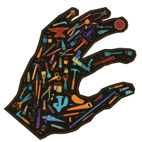
Ambacht in Beeld 2024
Illustration for the crafts festival (Amsterdam edition) 2024. Oh, and i also did those letters.

Bovenkamers key image
Key image for ‘Bovenkamers’, an interactive art installation for kids, produced by Tg. Winterberg.
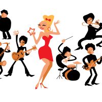
The Spinshots
i drew the Spinshots being very inspired by ’50s and ’60s illustrator Jim Flora. For a while, you’d see this image on our poster as the ‘Publicity Photo’.

Maison Tonale
Maison Tonale is an Amsterdam based live acid house band. They asked me to provide them with a key image that captures their vibe.
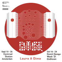
key illustration
By making a graphic illustration of the capsules visitors would be in on the art event, people could not expect this would be things they would be in: we did not want to give away too many details as the experience should be pure but the poster had to be a bit spectacular, ‘designy’ and showing the content. So this was my translation to the futuristic idea of human touch being wired between hubs.
Bernie’s Lounge
Bernie’s Lounge asked me to do do their record, poster and some identity illustrations. We chose to give them some ‘street credibility’ with a latin ‘big city’ feel to it and i made the cover illustrations with stencil print techniques.
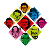
The men from AKB
For the album ‘Fortuna’ i had the artwork printed by Krijger Vormgave, a silk printer who specialises in art prints. He had something that we called ‘rainbow inks’ – colours that become lighter when printed over each other rather than darker. So I had to design thinking diapositive – and also keep in mind that the colours would change related to how the viewer holds the record in his hands. Printed on black paper.
So this is an illustration, made with photos made by Fred van Diem in that technique. Of course, the whole thing is that oyu actually have to keep the record in your hands to experience the effect, can’t see this on a monitor but hey! This is the best i can do for you. order the LP at AKB’s website.
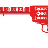
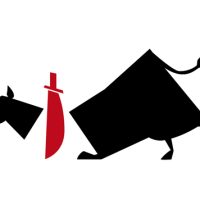
gun
‘the booker’s gun’ for Pepita de Pistolita.
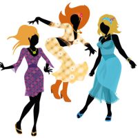
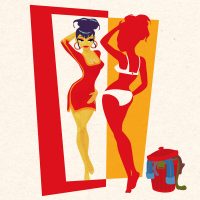
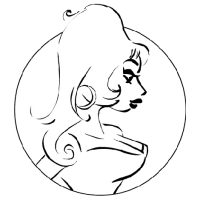
dancing girls
Metamorfose was an Amsterdam based shop for which i had the pleasure to do the identity. The idea was that they had something very special for any body type and that they would help you restyle yourself, coming out of the shop as a brand new you. I have to say that their ‘Ibiza’ preferences were not mine, but it was fun to do nonetheless and it was great working with them.

banner
Illustration for AINOA – used as a banner on facebook and such.
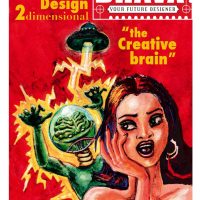
The Creative Brain
Before I had my current graphic identity i usually found myself inspired by pulp art and vintage propaganda. I had a period of promoting myself as ‘The Creative Brain’ and there was a time for ‘Your Future Artist’. Well, you get the picture.
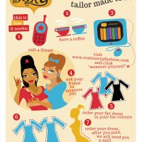
how it works
This is an illustration on how ordering a dress at Comic Sexy worked.
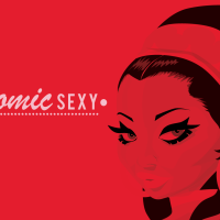
brand new me
Comic Sexy needed a lot of comic style illustrations. Great part of the deal for the over-all designer of the brand!
collaborator’s guide cover
Models, photographers and stylists got a book with inspirational material when they worked for Comic Sexy. This was the cover.
illustrations oy oy oy
the pictograms that appear in the night on the cover of ‘Oy Oy Oy’ (printed with glow-in-the-dark) were used as illustrations in the booklet on the CD and the opened double sleeve of the vinyl album.
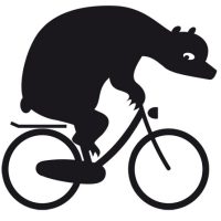
Bear on Bike
For Take A Bike Berlin I made a mascotte, inspired by the logo i made for them in an earlier stge. I thought it would be nice to make this bear a character to appear in various publications, ads and so on.
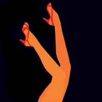
legs
During the ‘Comic Sexy’ period, i met tons of marketeers saying i should not ‘sell dresses’, i should sell ‘the experience’. Although I thought it was bull crap – i did sell the dresses I designed and they were of outstanding quality and made to fit each unique body, i also wanted to make it a success. So many of the publicity items have references to ‘pretty girls as they are pictured in comics’ and the feeling of being a pretty ‘comic’ girl. Well, at least it gave me a good time drawing and it provided the brand with nice artwork.
Benja illustrations
These illustrations heavily lean on Saul Bass’ artwork. It was the perfect ‘pictrogram-esque’ style for the identity of this period of Amsterdam Klezmer Band.
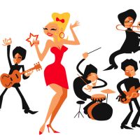
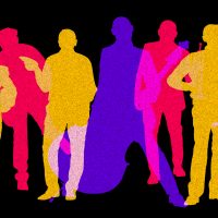
the magnificent seven (when they were 7)
Illustration for the Spinshots in our Turban period. I tried to have a good look at Jim Flora’s jazzy illustrations from the 50s and 60s and tried to make my own style from what i learned. The characters actually lok like the band members, that much i can tell for sure!
illustrations for ‘So Easy’
illustrations for ‘So Easy’ by Boyd Small. I did the album design with the association in mind of ‘buying dirty magazines in a brown bag’. So the lyrics inside had these drawings, that resemble ’60s cheesy advertisements in pulp magazines.
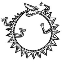
Ouroberos
‘Mascotte’ for Paxy Dragon. The fins were used as ‘identity particle’ in other illustrations, like the ones with the band members


