draax.nl•medium•illustrations
- draax.nl•medium•illustrations
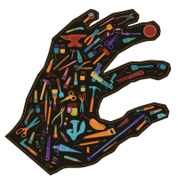
Ambacht in Beeld 2024
Illustration for the crafts festival (Amsterdam edition) 2024. Oh, and i also did those letters.

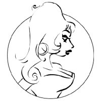
Bovenkamers key image
Key image for ‘Bovenkamers’, an interactive art installation for kids, produced by Tg. Winterberg.
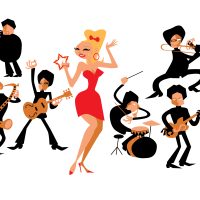
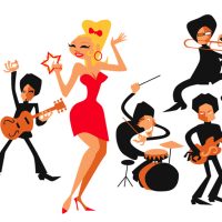
The Spinshots
i drew the Spinshots being very inspired by ’50s and ’60s illustrator Jim Flora. For a while, you’d see this image on our poster as the ‘Publicity Photo’.

Maison Tonale
Maison Tonale is an Amsterdam based live acid house band. They asked me to provide them with a key image that captures their vibe.
key illustration
By making a graphic illustration of the capsules visitors would be in on the art event, people could not expect this would be things they would be in: we did not want to give away too many details as the experience should be pure but the poster had to be a bit spectacular, ‘designy’ and showing the content. So this was my translation to the futuristic idea of human touch being wired between hubs.
Bernie’s Lounge
Bernie’s Lounge asked me to do do their record, poster and some identity illustrations. We chose to give them some ‘street credibility’ with a latin ‘big city’ feel to it and i made the cover illustrations with stencil print techniques.
The men from AKB
For the album ‘Fortuna’ i had the artwork printed by Krijger Vormgave, a silk printer who specialises in art prints. He had something that we called ‘rainbow inks’ – colours that become lighter when printed over each other rather than darker. So I had to design thinking diapositive – and also keep in mind that the colours would change related to how the viewer holds the record in his hands. Printed on black paper.
So this is an illustration, made with photos made by Fred van Diem in that technique. Of course, the whole thing is that oyu actually have to keep the record in your hands to experience the effect, can’t see this on a monitor but hey! This is the best i can do for you. order the LP at AKB’s website.
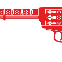
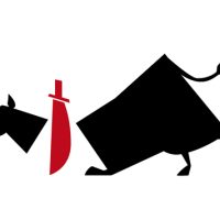
gun
‘the booker’s gun’ for Pepita de Pistolita.
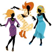
dancing girls
Metamorfose was an Amsterdam based shop for which i had the pleasure to do the identity. The idea was that they had something very special for any body type and that they would help you restyle yourself, coming out of the shop as a brand new you. I have to say that their ‘Ibiza’ preferences were not mine, but it was fun to do nonetheless and it was great working with them.

banner
Illustration for AINOA – used as a banner on facebook and such.
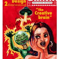
The Creative Brain
Before I had my current graphic identity i usually found myself inspired by pulp art and vintage propaganda. I had a period of promoting myself as ‘The Creative Brain’ and there was a time for ‘Your Future Artist’. Well, you get the picture.
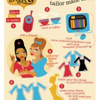
how it works
This is an illustration on how ordering a dress at Comic Sexy worked.
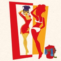
brand new me
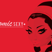
Comic Sexy needed a lot of comic style illustrations. Great part of the deal for the over-all designer of the brand!
collaborator’s guide cover
Models, photographers and stylists got a book with inspirational material when they worked for Comic Sexy. This was the cover.
illustrations oy oy oy
the pictograms that appear in the night on the cover of ‘Oy Oy Oy’ (printed with glow-in-the-dark) were used as illustrations in the booklet on the CD and the opened double sleeve of the vinyl album.
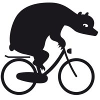
Bear on Bike
For Take A Bike Berlin I made a mascotte, inspired by the logo i made for them in an earlier stge. I thought it would be nice to make this bear a character to appear in various publications, ads and so on.
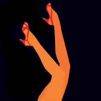
legs
During the ‘Comic Sexy’ period, i met tons of marketeers saying i should not ‘sell dresses’, i should sell ‘the experience’. Although I thought it was bull crap – i did sell the dresses I designed and they were of outstanding quality and made to fit each unique body, i also wanted to make it a success. So many of the publicity items have references to ‘pretty girls as they are pictured in comics’ and the feeling of being a pretty ‘comic’ girl. Well, at least it gave me a good time drawing and it provided the brand with nice artwork.
Benja illustrations
These illustrations heavily lean on Saul Bass’ artwork. It was the perfect ‘pictrogram-esque’ style for the identity of this period of Amsterdam Klezmer Band.
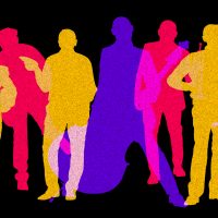
the magnificent seven (when they were 7)
Illustration for the Spinshots in our Turban period. I tried to have a good look at Jim Flora’s jazzy illustrations from the 50s and 60s and tried to make my own style from what i learned. The characters actually lok like the band members, that much i can tell for sure!
illustrations for ‘So Easy’
illustrations for ‘So Easy’ by Boyd Small. I did the album design with the association in mind of ‘buying dirty magazines in a brown bag’. So the lyrics inside had these drawings, that resemble ’60s cheesy advertisements in pulp magazines.
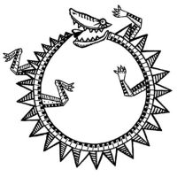
Ouroberos
‘Mascotte’ for Paxy Dragon. The fins were used as ‘identity particle’ in other illustrations, like the ones with the band members
art prints baby boom
Exclusively for the launch of my graphic novel Baby boom (and for some sponsors) i made art prints of material used in the comic, but reassembled. The piezzopiece prints are in different formats and were show at a solo show at Gallery KochXBos, Amsterdam.
Some of them are still for sale – contact me if you have interest.
A Room With A View
A Room With A View originally was made for the theatre show ‘Some Kind Of Golem’ by Amsterdam klezmer Band but the song for which this work was intended needed another image during the development of the show. So now it found its home at the waiting room of the Doctor’s Office of my friend Esther.
Power Cut
Power Cut tells the story of the band playing on a festival where the electrified sound was very bad. They played and played but the sound was horrible and too loud. Then there was a power cut and they played acoustically, unamplified. Suddenly, everybody was dancing and their gig was a great success. I visualised the power cut as if caused by a rat eating a cable in the PA system.
Op de Brug
Op de Brug ia s song written by Jasper de Beer about how the Amsterdam Klezmer Band met. Dick Hauser, the director of the theatre show Some Kind Of Golem associated the story with James Ensor’s painting ‘L’Entrée du Christ à Bruxelles’ and i thought it would be nice to put figures from that painting on an Amsterdam bridge welcoming the band.
Mooitje
This is an illustration coming with a song by Gijs Levelt about the cavias of his children, Although they look cartoony, they really are drawn after the likeliness of the two pets. The idea came from director Dick Hauser, who thought it should be cool if they looked a bit out of place in a night club. I added the Fleischer brothers feel to it.
Mendele
Mendele is a song by Job Chajes for Some Kind Of Golem. It was the last song to have a lyric and it turned out to be about the covid crisis, as the band had been unable to tour for two years. But beautiful things happened in that period as well, for instance the musicians finally had time to work on unfinished solo compositions and projects. The Van Gogh reference became a bit of a running gag, but i think everybody can see what is meant here.
Breekbrood
Theo’s song ‘Breekbrood’ is one of my favorites in the show. For the theatre show I made a closed door, leading to a room that resembles Van Gogh’s room in Ardès. I just made the perspective slightly more ‘correct’ and made the composition of clean planes and lines, giving the place something eerie rather than cosy. And studying the Van Gogh painting, i wondered why there was a chair in front of that door, while the room was painted from inside. Did van Gogh not wanted to be disturbed when he painted it? Did he want to keep Gauguin out? The high view perspective on the room gives the feeling as if we’re looking through a spy cam.
This empty room, with a chair in front of the door to lock it and keep people out, while it seems empty… I thought it was fascinating, and made more perspectives as if the viewer is a ghost in this abandoned room.
The empty frames provide an even more uncanny atmosphere. And then suddenly we are outside. Alone, in a landscape that is both alien and familiar. Where are we heading?aunt peppie
Aunt Peppie is the opening song of the show. Dick and i thought it would be good to sort of give hints to what is coming. Even the moon and the chair are hints. Of course, the picture on this site is too small to see it, but in the bottles are a lamp, a paper boat floating on water, a letter, soap and a rat’s skeleton.
props
Part of the fun of making an animation movie is making the props: things the character use, hold or are just there in the background. We could do a lot of inside jokes here. The scenes were so short and the images so rapidly moving that you’d hardly see the naughty jokes we’d make. Here you can quench the bottomless thirst of your inner pervert ast the images are frozen and as long on your screen as you wish.
illustration overview
Illustrations for an event at the Milkyway, Amsterdam. US president Bush jr spoke of Iran, North Korea and Afghanistan as the ‘Axis of Evil’ and would soon be bombing. There was a night with discussions about the idea of a supposed ‘axis of evil’ Was it there? Was bombing a way to deal with it? They idea came from my client Rachida Azough: ‘you don’t bomb cute girls’.
Obviously, the pin ups were a satirical way of saying we’re talking about humans, not ‘evil forces’. The logo of this event was the ‘smart bomb’.
gigi
Like almost every Dutch comic and graphic artist, I am a huge fan of Peter Pontiac. When i was a kid, there were only two futures: in one, you’d become like your father, and in the other you’d be like Peter Pontiac. I have never regretted choosing the latter.
Peter drew for music magazine Oor and his characters were dark, his comics had punks and drugs and people in the gutter. I still draw army boots the way i saw Peter Pontiac doing it and when i finally met him because of an exposition where we both had work presented i totally fell in love again. The man had eyes like he used to draw! Very deep, very friendly and seemingly all-knowing.
He made a portrait of me for my 40th birthday – you cannot believe how honoured i was. And he asked me to draw a something for his magazine it had to be a tribute because as a young boy, i already understood how pretty his character Gigi was. I think Baby Boom even has a bit of Gigi in her. But Gigi was a bit inspired by Deborah Harry – i think. And i like Deborah Harry too!
So just to give credits: the lady in front is supposed to be Gigi, the guy in the back is supposed to be Pontiac’s Gaga, and well, i am in the middle.
Martin’s Monthly Pin Up Parlour ads
‘Martin’s Monthly Pin Up Parlour is an event for comic, low brow and pin up artists, or wannabe’s. Every month we invite a model that is dressed up and given make up by my partner Laura A Dima and i prepare some exercises for the participating artists. Besides that I host the evening and play vinyl pebbles that are in tune with this months theme.
I drew this picture of my all time heroine Baby Boom for a teeshirt years earlier, but it seemed to fit the purpose.
Assasin’s Dance
‘A Brief History of Korean Martial Arts’ is a book written by professor Bok Kyu Choi. It’s seasoned with popular myths and folk stories about fictional and non-fictional warrior characters from the history of Korea. I was asked to make illustrations for the book in ink: i made these illustrations with black ink and water – depending on the amount of colours i needed, i painted more or less layers.
Nongae
Nongae was, according to Korean folklore, a gisaeng (an enslaved courtesan) who loved Korea so much, she thought of a trick to contribute her share to Korean victory during the Japanese war. She seduced Japanese High Commander Keyamura Rokusuke, held him tight and jumped from a hig cliff into the Nam river.
Ahn Jung Geun
‘History is the propaganda of the victors’ said George Orwell. The book A Brief History of ‘Korean Martial Arts’ by prof B. K. Choi is seasoned with folk stories from Korean history. They reflect the country’s spirit and system of virtues. Here is Ito Hirobumi, who was shot by Ahn Jung Geun in 1907. In Korean he is a freedom fighter, an Japan, he is an assassin.
GwanChang
The book A Brief History of ‘Korean Martial Arts’ by prof B. K. Choi is seasoned with folk stories from Korean history. They reflect the country’s spirit and system of virtues. Often, warriors who chose death over captivity or just loosing a battle, are depicted as heroes. Here’s Gwanchang, who went back to battle he was loosing three times until he was honourably killed.
artwork for Sugar Skulls
For the videoclip for ‘Sugar Skulls’ i made a lot of drawings of people visiting the wedding party of one ‘Black Eyed Suze’ and one ‘Marigold’. The lyric is about our tendency to be prejudiced towards ‘other groups’ and to make life worse than needed for minorities.
So i thought it would be great if the guests at the party all were types other people ‘have an opinion about’. Of course, the song is related to Halloween and the Day Of The Dead, hence the Mardi Grass rhythm and the types we see. But in the end, the song is about how death makes us all equal and that no one is or knows really better than another.
Miss Korea
This may be as hard to understand for you as it was for us then. President Bush Jr of the VS talked of an ‘Axis of Evil’ consisting of Iraq, Iran and ehm, North Korea. Nobody knew what the link between the three was and how this ‘evil empire’ worked. And if there was such a thing – what would you do? How many people, in percentage, need to be ‘evil’ to start a war against such a country?
‘Miss Korea’ was one of the pinups i drew for ‘Exit of Evil’. This was an event about the Gulf war, and hosted many thinkers – asking if ‘the Axis of Evil’ was something real or fiction, and what to do now bombing was going on. The idea was ‘you don’t bomb cute girls’ an ironic note on the fact that the VS were bombing real people with power politic reasons rather than anything else.
Later they added Cuba, Syria and Libya. However sad this view on the world might be, i’d love to draw Miss Cuba, Miss Syria and Miss Libya – I hope one day I will find time or a client who needs this 😉
Miss Iran
‘Miss Iran’ was one of the pinups i drew for ‘Exit of Evil’. This was an event about the Gulf war, and hosted many thinkers – asking if ‘the Axis of Evil’ was something real or fiction, and what to do now bombing was going on. The idea was ‘you don’t bomb cute girls’ an ironic note on the fact that the VS were bombing real people with power politic reasons rather than anything else.
This may be as hard to understand for you as it was for us then. President Bush Jr of the VS talked of an ‘Axis of Evil’ consisting of Iraq, Iran and ehm, North Korea. Nobody knew what the link between the three was and how this ‘evil empire’ worked. And if there was such a thing – what would you do? How many people, in percentage, need to be ‘evil’ to start a war against such a country?
‘Miss Iran’ was one of the pinups i drew for ‘Exit of Evil’. This was an event about the Gulf war, and hosted many thinkers – asking if ‘the Axis of Evil’ was something real or fiction, and what to do now bombing was going on. The idea was ‘you don’t bomb cute girls’ an ironic note on the fact that the VS were bombing real people with power politic reasons rather than anything else.
Later they added Cuba, Syria and Libya. However sad this view on the world might be, i’d love to draw Miss Cuba, Miss Syria and Miss Libya – I hope one day I will find time or a client who needs this 😉


