
Mesafesofi
Mesafesofi is the fourth single taken from the album ‘Bomba Pop’

Fire
Cover for the third single of Bomba Pop.
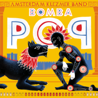
Bomba Pop Album design
‘Bomba Pop’ is the name of the 2024 album by Amsterdam Klezmer Band. We came up with the name after a brainstorm with Gijs (Trumpet) and Jasper (Bass) in which they explained that they had to break a lot of their material to pieces, in order to get this progressive, new sound. We decided the album was about breaking that what you love, in order to become better.
So i translated that into the Greek / Etrusk habit to paint their heroes on vases: everyday (breakable) objects used as canvases for art and storytelling. Not unlike an LP, I thought. So the imagery is based on Greek mythology and the popular outlook of Greek ancient art, but with new imagery. On the cover we see a modern day Hercules with a lion. Has he tamed the lion? Are they friends? Is this a ritual before a fight? In the back we see the city wall of Hamburg, since this album is produced by Dunkelbunt, who is from there.
We also felt an urge to communicate through the imagery the main focus of the band: to connect people of all backgrounds. This album came out in a heavy time and the band wanted to communicate (although not too obvious) that they were above tribalism: they’d connect everybody. They make people feel good. Hence the dove: the album came out in 2024, after all.
The photo of the band is made by René Nuijgen.

On Mala
‘BOn Mala’ is an album by Amsterdam Klezmer band, released in 1023. I was asked to design the identity for that period: the album, the singles, the posters and the visual concepts. This cover is of one of the singles, and has the name ‘On Mala’.
‘On Mala’ tells the story of a man going to war after being promised a Lada by his government. He gets back from the war missing a leg and therefore can’t use the acceleration pedal of his new car.
The identity concept boils down to ‘to break what you love in order to make it better’. The images on the covers and posters are inspired by the ancient Greek and Etrusk vases. Everyday (but breakable) objects depicting heroes and their actions. I replaced ‘vases’ by ‘albums’ and ‘singles’ and made an iconography inspired by Greek mythology but linked to the songs by Amsterdam Klezmer Band.
We see a guy driving a Lada with a leg on the roof of his car. The arrow indicates it’s Achilles’ leg, so the guy driving the car must be Paris – who apparrently also was given a Lada by his government.
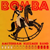
Bomba
‘Bomba Pop’ is an album by Amsterdam Klezmer band, released in 1023. I was asked to design the identity for that period: the album, the singles, the posters and the visual concepts. This cover is of one of the singles, and has the name ‘Bomba’.
‘Bomba’ tells the story of a man lusting for a woman who later ruins his life.
The identity concept boils down to ‘to break what you love in order to make it better’. The images on the covers and posters are inspired by the ancient Greek and Etrusk vases. Everyday (but breakable) objects depicting heroes and their actions. I replaced ‘vases’ by ‘albums’ and ‘singles’ and made an iconography inspired by Greek mythology but linked to the songs by Amsterdam Klezmer Band.
So here we see a girl based on Helen of Troy acting as a femme fatale riding a rocking horse full of wine at a wild party – fitting the atmosphere of the music. The fun is dat this kind of icons are very good for minimal animation: for the promotion i made a moving version as a gif and as a printed lenticular card.
Joop van der Linden
Joop van der Linden is known mostly as the trombonist of Amsterdam Klezmer Band. But he asked me to do the design for this experimental solo album he wrote and produced. I had his music generated to image through After Effects and turned separate stills into a new image, combined with hand coloured typography.
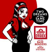
Two Dreams at the Same Time cover
Two Dreams at the Same Time is a Draax original sung by Rosie Stevens. Although i had the idea to make a cover with images subtracted from the videoclip i made for the song, the communication agent i asked to help me spread the word during the launch period said i should turn the singer into a comic version of herself. I listened to his advise and this is the result.

Sondra Anversa
Cover for the single ‘Sondra Anversae’ by Amsterdam Klezmer Band featuring Gregor Terror and Slongs

Hadi Gidelim
Cover for the single ‘Hadi Gidelim’ by Amsterdam Klezmer Band featuring Meral Polat

De Nacht
Cover for the single ‘De Nacht’ by Amsterdam Klezmer Band featuring Ferry Heijne

Domnees Toene
Cover for the single ‘Domness Toene’ by Amsterdam Klezmer Band featuring Bert Hadders
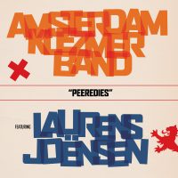
Peeredies
Cover for the single ‘Peeredies’ by Amsterdam Klezmer Band featuring Laurens Joënsen

Simmertwirre
Cover for the single ‘Simmertwirre’ by Amsterdam Klezmer Band featuring Piter Wilkens

Aunt Peppie
cover for the digital release of the electronified version of ‘Aunt Peppie’ – since this was a digital release, the cover has different colours, sometimes shown animating.
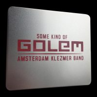
Some Kind Of Golem CD package
The CD Some Kind Of Golem is packed in a tin box, with a silk printed logo on the lid. Inside there is a booklet with most of the illustrations i made for the show.

Tournée Générale album art
Tournée Générale is the second album of Fint Fransk Orkester. I had the honour to do the design this new album and periodical identity and drew them in a sort of impressionist style playing in an art nouveau kind of club. I like it that there is am anomaly here since Impressionism was earlier than Art Nouveau, but it all refers to their music, trust me.
Hidden Tracks
‘Hidden Tracks’ is an AKB compilation of tracks that were never published before: demos, rehearsals, tracks that did not make it. It came out on cassette in 2022 and I did the design for all parts in it.
I made a little soft fabric pillow cover so that you could take the boys to bed, a lenticular postcard, stickers, and other designs. Note the golden cassette! The photo on the cassette cover is made by Tessa Posthuma de Boer.
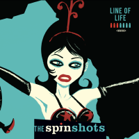
Balkan Dinosaur / Line of Life
Cover for the EP ‘Balkan Dinosaur / Line of Life’ by the Spinshots. Part of the EP series ‘Seven Bullits, One Gun’: The Spinshots brought out this series over their last year of existence but never quite finished it. The idea was that the album was a ‘Whodunit’: it tells the tale of a murdered young woman and listeners can guess who the killer is by following cues from lyrics and design.
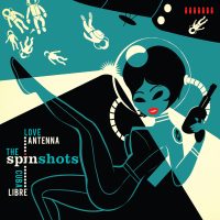
love Antenna / Cuba Libre
Cover art for ‘Love Antenna’ and ‘Cuba Libre’ EP by The Spinshots.

Sugar Skulls cover
Cover for ‘Sugar Skulls’. These are one ‘Black Eyed Suze’ and one ‘Marigold’ who were not allowed to marry and consume their love in life. But, after death, nobody can say anything anymore: they marry on a halloween party.

Multiple Reality Disorder
this is the cover for my single ‘Multiple Reality Disorder‘ – ironically coined ‘The Most Urgent Pop Song In History’.
To know more about the project, either look at my music department or at the tag ‘The Identity Machinery’ on Instagram.

West Hell Five
Artwork for West Hell Five, an Amsterdam based spy fi jazz combo. The photo is made by Mirte Ter Maten and to keep it real, the title is, James Bond style, projected on the girl. No photoshop here peeps. (well the photographer obviously did some colour correction)
Inside was a gigantic poster of the lady with the gun. On the back side of that poster we see a spy fi novel drummer Wilf Plum wrote on pages ripped from a book. The book has a hole in the middle hiding a gun.
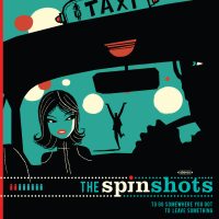
to Go Somewhere, You Got To Leave Something
Part of the singles series ‘Seven Bullets, One Gun’ – with clues in the artwork and the lyrics.
Emanuel Wiemans made this beautiful drawing and I did the design.
Désirs Mutuèls
the Désirs Mutuels single came out as a dvd with a videoclip. For the clip, we went into an abandoned warehouse with a working elevator. This was all done ‘no-budget’ and the cover art was silk printed by hand on the cheapest DVD packages we could get our hands on. Still love the song, the clip and the package art, though.
Y
‘Y’ came out on casette – as the 2nd cassette album by the band. The first one was ‘As Experienced on the Famous Last Breath Show’ but I can’t find that one any more.
In that time (early 90s) I was reading a lot about alchemy. So kings, queens, sulphur, crimson, dragons, boiling pots – all found a way into my work. Fortunately, I had a sense of humor so the depicted phenomenon of ‘killing the dragon’ did not work out too pretentious. I think.
The ‘Daily Drag’ was a newspaper from the island on which the band resided: Oaxakaah. In there was gossip and the lyrics.
Blue For The Occasion
‘Blue for the Occasion’ is Paxy Dragon’s third CD album. (hey guys, those were the ’90s!)
I hope to find back some pictures of that time, I might post it in the ‘behind the scenes’ section of this work. My Friend Vi made it to the cover and to the teeshirts. Must have one of those somewhere to…Gainsnord
Gainsnord is an initiative of the Dutch DJ Guuzbourg, who coined the term ‘Zuchtmeisjes’. He asked several Dutch bands to make a cover of a Gainsbourg song – the Spinshots chose ‘Qui Est ‘In’, Qui est ‘Out’, which became the single of the album.
For this record i had the honour to work with Dutch well known comic artist Hanco Kolk, who made the beautiful portait of Serge for the cover.
demos
Cover for the bandcamp album ‘Demos’.
This is actually a drawing I made for my first website – everything in flash, full of animation. That side was like a game: you were in space with the Designdevil (me) and you certainly would get lost. But now I could use this specific picture for the albumcover – demos of songs from the ole’ days.kathy
‘Kathy was Paxy Dragon’s first CD album. Kathy was a Paxy Dragon’s song, written by Roelof de Groot, that was very popular amongst fans. Wherever we used to play people in the audience would shout for ‘Kathy’, so it became a running gag to play it late in the set..
The song is not on the album, so it ends with a fan shouting ‘Kathy!’ after the last track.
The cover illustration is made by Ingrid Bockting.
Y
Paxy Dragon’s ‘Y’ was a cassette album, recorded on Roelof’s or my 4-track. For this album, I designed a letter font and we developed a language, including native signs… making it impossible to read the credits.
With the cassette came the ‘Daily Drag’ – the International Newspaper written in English so people could understand a bit what we were all about.
Omnes Tredecim Boni
‘Omnes Tredecim Boni’ is the title of a Paxy Dragon album in which they sing about rituals and habits of their island. The title is a bit of a practical joke: the band was judged as ‘pretentious’ regularly so they made up a latin sounding title that translates to ‘All 13 Great’ – referring to the 13 songs on the album. In the Netherlands, it used to be common that you could buy ‘All 13 Great’, of ‘All 13 Hits’ albums on which the masses’ favourite tunes were covered by anonymous bands. Usually, these tracks were lame.
Since CD’s usually are so ugly, i thought it would be great to print the transparant plastic as part of the design to go with the paper behind it.
gainsnorth
When Guuzbourg asked the Spinshots to contribute a song to the cover-album ‘Gainshorth’, a tribute to Serge Gainsbourg, he also asked me to do the design for the records. That is, our single and the album itself. He already asked Hanco Kolk for the artwork, so I could work with one of the greatest comic artists the Netherlands have to offer.
seven bullets, one gun -EP series
‘Seven Bullets, One Gun’ was an EP series by the Spinshots. The idea was that we made a ‘Whodunit’ over 7 vinyl singles. Clues about the murder of a Romanian runaway girl were given in the texts and the covers.
Note: the drawings on the first two covers were made by Emanuel Wiemans, the drawings on the last two covers were made by me.
désirs mutuèls
Désirs Mutuèls was a song I wrote for Paxy Dragon, although originally it was in English and had the name ‘Mutual Desires’.
When I started the Spinshots, it seemed a nice idea to make a completely different version, and the drummer came with the idea to translate it to French (done so by Natasha Cloutier) to give it a more ‘exotic’ feel. We recorded a videoclip that came out as a single, and I silk printed this cover for it.
qui est ‘in’, qui est ‘out’
We were asked by dj Guuzbourg to make a cover of Serge Gainsbourg’s ‘Qui est ‘In’, Qui est ‘out’, for a compilation of Dutch bands paying hommage to the French songwriter.
It was nice to know that Charlotte agreed on our version. The song came out with different covers, the futured image is an online version.The other images are the cover and the label of the vinyl single, which we shared with fellow Amsterdam band Juicebox, who covered ‘Chatterton’. The cover image was drawn by Hanco Kolk, which is a Dutch Comic Artist I admire very much, so it was flattering to have his work on our cover.
smiths of rhythm & tunes
One of the nicest ways to describe our music was, if you ask me, ‘Rhythm & Tunes’. I wrote a song called ‘The Smiths of Rhythm & Tunes’ as a bit of a joke: since we wore turbans at the time because I am a huge exotica fan, I thought it would be funny if we our own ‘Sultans of Swing’.
We had some changes in the personnel at that time – hence different covers. It was re-released as ‘Cleans-0-tech’ which was a song that sounded like a commercial break in the set.
fint fransk orkester sleeve
The Norwegian Francophile combo ‘Fint Fransk Orkester’ asked me to do a sleeve in ‘Paris Fin de Siècle’ style. Well – I am a great fan of the art made in that period so I loved doing that. I designed their lyrics as an 1900’s paper magazine, the cover has an extra layer of gold and for the caricatures i had a good look at my hero de Toulouse-Lautrec. The poster was also printed as a give-away and bag for fans.
music for fingers
The artwork you see on the cover of this album is ‘The Finger Rub Rug’, made by my girlfriend Laura A Dima. It consists of 1300 replica’s of my fingers and are placed as a ‘single bed’ in a designated white room. Under the mat that hosts the fingers is a warming element and a haptic speaker giving the work a heartbeat.
Laura asked me to compose music to experience the artwork with and we decided on a quadrophonic piece with 4 elements coming from four speakers. So although one side was more scary, another more humorous, the others more ‘erotic’ and ‘exotic’, together they’d make one composition, fitting to the heartbeat.
People who dared to lie down on the Finger Rub Rug, would feel an extra heartbeat in their chest, warmth coming from the fingers and hear the ‘exotica’ soundtrack from 4 directions. One of the (many) good aspects of this artwork is that you were in this room on your own, which gave a completely different dynamic than being alone in, say, your living room. This was a very good way to contemplate and reflect on things.
So since ‘Music for Fingers’ is an album having the full composition brought back to stereo and 7 outtakes, using a photo of the artwork seemed to provide the best cover.
this time no lies
Blues singer Boyd Small asked me to do his cover art. I asked photographer Susan ArbabZadeh to make this picture in the cafe we frequently visited: ‘De Diepte’. The owner was kind enough to give us the keys and let us make these pictures here. I asked Boyd to write some lyric on a beermat, as if he was writing them in the bar and this picture started the practical joke of never showing his face on his covers.
oy oy oy
Amsterdam Klezmer Band made an album that showed their extremes, and I thought it would be great if I could put something of that in the design of the cover. So I made an illustration that changes according to the light situation it is seen in: in the dark we see another image than in the light – representing our duality: what do we show and what do we hide, that only comes out ‘in the dark’?
mokum
‘Mokum’ was the first album I did for Amsterdam Klezmer Band. They wanted to give their fans a present and explained to me that although they were called the ‘Amsterdam Klezmer Band’ not everybody considers them to be ‘Klezmer’. They aim for the genre to be alive, and therefor mix it with other types of music and so I thought of this ‘devil in a box’ cover.
I asked them to give me their back stage passes from over the years to make a chain for the little devil and i used more of those on the inside design. I have to say i really like it that purists don’t find them ‘Klezmer’ enough – they are very interesting musicians and very interesting individuals as well. I feel lucky I was asked for all their covers ever after this little devil.
fortuna
‘Fortuna’ was for emotional reasons a very special album for AKB, but the music also seemed to beam more reflection. I thought I’d make this esoteric looking cover and asked Krijger Vormgave to silk print black paper it using reflective inks that change impression, depending on how you hold the cover in your hands. Also, the inks work like the colours of light: topping ink on ink does not ‘add’ to a darker colour, but ‘subtracts’ to a lighter colour. This was an attempt to capture the unpredictable way the music on the album was created.
blitzmash
‘Blitzmash’ was an AKB record in which the band experimented with drums, beats and instruments that would not classify as ‘Klezmer’. I thought of a practical joke, using a ‘bellydancer’ for the cover art. On the CD we had an extra future: the dancer would be moving when the CD was pushed out of the sleeve.
Benja
Amsterdam Klezmer Band developed ‘Benja’ with Dick hauser. They asked me to do the poster, recordcover and stuff. I asked photographer Fred van Diem to make a picture of a bride and used that photo as a reference for this drawing. This was the starting point of all publicity material and the cover.
nasmak sleeve
Nasmak was a band that made lots of demo tapes on cassettes somewhere in the 80s. When they brought out these tapes in 2019 (!) Joop van Brakel asked me to do the sleeve design. I loved what they made and did the design like i would have done in the 80s: with a typewriter, punaises and glue. The cover is just a photo, everything is really glued and pricked there.
The cover illustration with the meat flag is made by the illustrious band member Joop van Brakel, in co-operation with Rembrandt.
never so right
Never So Right is the first (and only) LP recorded by the Spinshots. I wanted the cover to look like one of those albums with a great cover and shitty music on it, as a practical joke. We asked photographer FotoFloor and stylist Iris Satijn to help us with the cover image. Emanuel Wiemans helped me with the handwritten typography and on the inside you see the musicians of the band in a toy rikshaw. This all should represent the serious-but-not-serious outlook of the Spinshots.
amsterdam beat club 10 years anniversary album
Amsterdam Beat Club is an event organised by Ir. Vendermeulen, in effect the ‘Night Major’ of the Amsterdam I Love. His events are 50’s and 60’s inspired dance evenings with bands and acts. When he brought out a compilation album with bands that played on his events, he asked me to do the art direction and graphic design. The photo’s are taken by Myrthe Ter Mate and the models are dancers of Amsterdam Beat Club


