draax.nl•medium•Graphic design•posters
- draax.nl•medium•Graphic design•posters
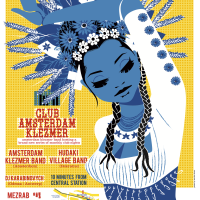
Club Amsterdam Klezmer posters 2022 – 2023
Posters i drew and designed for CLub Amsterdam Klezmer.
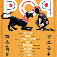
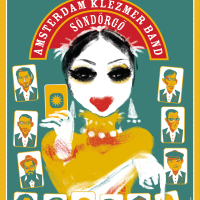
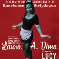
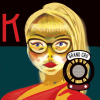
On irregular intervals, Amsterdam Klezmer Band hosts an event inviting a band from somewhere in Europe to jam on stage. Since the bands often are Eastern Europe Roots bands, i thought it would be good to show a traditional bride from the area the guest musicians came from. As if AKB has a one day marriage with different cultures every now and then.
Under the clothes i draw for every event, is the same girl, a muse if you will. By changing the colours and the outfit, i created a strong identity for the event, looking different every time.
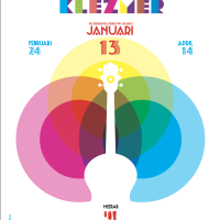
Club Amsterdam Klezmer / Klezmer Lab
Posters for ‘Amsterdam Klezmer Lab’ and ‘Club Amsterdam Klezmer’.
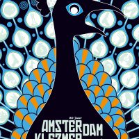
Amsterdam Klezmer Band organised two series of events. The ‘labs’ were experimental events with renowned guest artists, and the ‘Club’ events were also with guests, but the emphasis would be on making people dance.I translated that into an iconography in which the ‘Club’ brought things together: we see different circles merging their colours, whereas the ‘Lab’ is the ‘exploding’ version of that idea. (the association with an explosion in an experimental lab was too funny not to use)
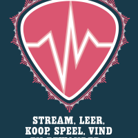
Please Don’t Stop The Music poster
Poster (and logo) for Please Don’t Stop The Music, an initiative by Andries van Wieren, to help Dutch music acts through the Covid-19 period. Peter Hordijk (who also built this site) and I worked overnight to launch the site just the morning after we got the assignment.

Don’t Stop The Music
Poster for ‘Don’t Stop The Music’, an initiatief by Andries van Wieren and 3S music to help Dutch bands and music artists in times of the Corona pandemic.
‘Don’t stop the Music’ is a site where you can hear Dutch artists, listen to their music, buy their records and services, mostly as music teachers or coaches. It had to be realised over night, and Peter Hordijk, who built the site (and this site, too) and i had to work pretty hard. But with effect, i like to think!
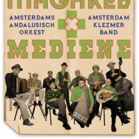
maghreb and mediene
However much i love to design posters, this kind is the kind i usually try to void: people give me a photo and say ‘we want a poster, can you take this picture and make a poster with it?’ – For everyone who reads this: the more free you set your designer, the better the result! I try to find out how to communicate your story in one image and that doesn’t always means you need to show a picture of your band. BUT in the end, after the colouring and the nice typography i actually was happy with it so i am showing it here.
If you plan on hiring me as your poster designer, be sure to present your request without having design ideas though: in the end, that’s what you employ me for.
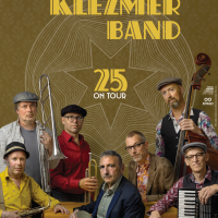
tour poster
For their tour celebrating 25 years of the band, i got a promotion photo to work with. It was a bit hard for me because usually i design from scratch and if needed, ask a photographer to picture something specific. But the photographer was smart and left a big playfield open for typography and the graphic i designed: 25 rings meaning 25 years, a circle being a star at hart symbolising the synergy of 7 individuals coming together in a band. I also loved it that we could keep it very basic: hold your phone close to the code and book a ticket – that is about all information!
Because they look a bit like people from bygone times i thought the typography should also resemble 1921, rather than 2021. The whole thing fits their music well: traditional and contemporary at the same time.
The photo is made by Tessa Posthuma de Boer.
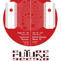
posters
The poster for Future Affair was tricky. The work, as designed by Laura A Dima, provides a very strong image, yet we did not want to give that away. We needed a poster as a window to the content and advertising the experience, but if we would show how Laura would do that through her artwork, we felt we were downgrading the work. So i designed something with an illustration, almost an infographic about physical ‘touch’ (of the hand) being wired from one capsule to another.
The artwork explained in short: a luring sculpture in one hub wires data to the other hub when touched. In the other hub, a machine is triggered to caress the visitor sitting there through a machine. This project caught the attention of the Technical University as well as social scientists as you don’t see who you are caressing. The artwork brings ‘communication’ to a basic level, a level we feel all comfortable with – yet we do things we would not do if we would have seen the other person.
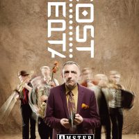
Septacost
Poster for Septacost, a music theatre show by Amsterdam Klezmer Band. I had the honour to write the script and do the direction of the first version, i designed the stage, did the art direction and of course designed the posters.
In the tradition of Saul Bass, i try to communicate the concept of a whole show in one single and simple image. So i thought the content boiled down to ‘you can be lonely in a group’ and came up with this simple idea; the whole group moves during the photoshoot except for singer Alec, he has to stand really still. This way we see a distinction between him and the group he has been touring with for then twenty years. The photo is (brilliantly) made by Eddo Hartmann, check him out – this man is amazing!
Kali Maya
Poster (autonomous work) with Kali – stating ‘Nothing lasts Forever’. I called this poster ‘Kali Maya because Maya posed for it and ‘Maya’ means the ‘veil between us and reality’. The poster is silk printed by hand in 5 colours and is 1.20 cm high.
If you want to buy a print (there are two left) mail me!
heden Stad
Poster for Hotel Modern. I wanted to emphasise the loneliness one can have living in a city: the feeling that ‘much is happening, but you’re not part of it’ can be heavy, especially for young people. So i asked photographer Tza Tza to make these pictures of the actors and i ripped the prints into this poster.
club tour poster
Poster for Amsterdam Klezmer Band during their ‘Fortuna’ tour. I tried to catch the somewhat ‘esoteric’ feel of the material on this album – there was a lot of reflection going on in the band, at that time. AKB are very integer with their music and i think on this album they made quite a break though reaching deeper layers that are audible in the music.
Club Amsterdam Klezmer
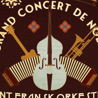
Club Amsterdam Klezmer is a monthly event organised by Amsterdam Klezmer Band. The band invites other bands or acts and james with them. Sometimes the guests are the support act, sometimes AKB is the support act. But most of the time they are together on stage.
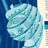
I was asked to create a poster with a clear identity, for a new bill every month. I thought it would be great to give AKB ‘a new bride’ every time, so i drew a girl in a position that would return on every poster, but every time she’d wear the bridal attire of the country where this month’s guests were from. By choosing a strict and simple colour scheme algorithm, the identity was strong and there was enough variety to keep the poster interesting on the street
Benja
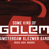
Poster for Benja. Benja was a music theatre show by Amsterdam Klezmer Band, directed by Dick Hauser. For this poster we asked Fred van Diemen to make a photo of a girl in bride’s attire playing the harmonica – representing the girl in the piece. The other illustrations lean heavily on Saul bass’ style, who is a designer i off course deeply appreciate.
Wijze Lessen
This is a silk printed design; in fact, not a poster but the world’s biggest business card. i made it for a philosopher who brought talents together.
‘Je moet niet denken dat een ander denkt zoals jij denkt’ means ‘you should not think someone else thinks the way you do’, and ‘Wijze Lessen’ means ‘Wise Lessons’ (if this is even English). I thought my client was a person crying in the wilderness: loud, with good ideas but unheard by policy makers. So i made a huge business card for him: it is one meter high and about 65 cm wide.
Rhythm & Tunes
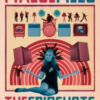
Hand silk printed poster for the Spinshots featuring new singer Flora Dolores. I have always liked the term ‘Rhythm & Tunes’ to explain ‘what kind of music i make’.
Later we tagged in ‘Neo Exotica’ but i never really liked that denotation – it feels restricting to have a genre that seems too framed. But yeah, bookers want to know what they book.Anyway, here is a poster for a band that really is inspired by the ’50s and ’60s exotica wave but mixed it with punk, beat and soul. Beat, not Beats.
akb 15 jaar
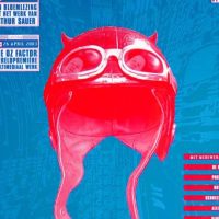
This was part of my first assignment for Amsterdam Klezmer Band, They were together and on the road for 15 years and wanted to give their fans a present. So they recorded live versions of the songs they voted to like most and i designed a key image, the album and the posters. i asked them for the stage passes they had saved up in a big pot over the years and used that as a necklace for the devil jumping from the box. There are some secrets hidden in the design, so i wont tell them here.
West Hell Five poster
Poster for the Amsterdam based spy fi band ‘West Hell Five. The photo was made by Myrthe ter Maten, the model is Marieke Bos. The typography is projected on the model so i had this sketched out very carefully and the model had muscle strains the next day. It never ceases to amaze me how unnatural models must bend their bodies to occur natural on photos.
on the back site of the poster is a novelle written by drummer Wilf Plum. I did the typography of the story on seemingly torn pages from a book with a hole in it to hide a gun.
Metamorfose posters
a poster and a business card – Metamorfose was a show where you’d walk in as one person and out as a brand new person. Stylists were ready to give you a more glamorous look and you could buy the while outfit if you liked it. The whole thing was quite ‘Boho’ – so not so much my style but i think I got the best of both worlds!
We’ve Got Soul
‘We’ve Got Soul’ was a dance performance choreographed by Maggie Boogaard, who run the company called ‘Dragon Productions’. I had the pleasure to do all her posters when she was still living in the Netherlands (she moved to Paris and opened a dance school).
This is the poster for her show We’ve Got Soul’
T I M poster
The Identity Machinery is an art project in collaboration with my partner Laura A Dima. We bring to life a person suffering from a Multiple Reality Disorder. But maybe it is just a story about the possibility of multiple realities.
On this poster, you see the characters in something that seems a mix between a lab, a church, a prostitute’s street, a strip show and a jail. Note that the typography consists of particle hexagons.
