draax.nl•medium•Graphic design•other
- draax.nl•medium•Graphic design•other
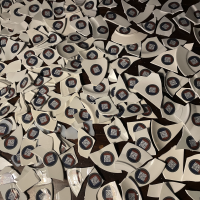
promotion shards
Since the concept op the album ‘Bomba Pop’ is ‘breaking what you love to become better’ we had the band dancing on plates and cups, breaking the stuff while doing a wild Sirtaki. Photographer René Nuijens found a perfect location for the publicity photo and we gathered the shards to make businesscards to promote the album on music professionals fairs.
click here for the album design and the identity images of the singles
graphic design in BB goes to A
Baby Boom is outside a lot in ‘Baby Boom in Amsterdam’ (working title)
Since the story we follow is actually a ‘Red Herring’ to the real story that is told by the surrounding characters and th surrounding itself, the graphic design of the posters, interfaces, stickers and logos play a big role. But these are always very small sized since they are in the background. Here you can look and laugh at some of these designs.
I don’t regret
typographic work for Some Kind of Golem by Amsterdam Klezmer Band
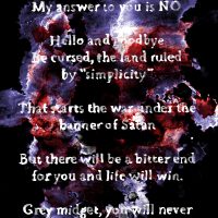
Hello and Goodbye
Hello and Goodbye is a lyric by Alec Kopyt, sung in the theatre show Some Kind of Golem. Director Dick Hauser and i did not want an illustration on this place: too heavy, to literal. So i made this typographical image.
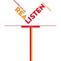
routing the mind
Inside the 10 floor high building of Rabobank Heerenveen, i designed an ‘alternative routing’ – or perhaps it should be called ‘a routing for the mind’ connecting the content of the departments with quotes from historic people. It looked a bit like a tube way map, but with quotes where the stations would be.
Words that are there in a bigger font, are the breaking point of a sentence – and by giving it two colours i added meaning to each word. ‘Volgende’ is Dutch for ‘Next’ but if you use only the part that says ‘volg’ it means ‘to follow’. This way i tried an audience to not take the quotes for granted. For instance the quote ‘Succes is the skill to move from one failure to the next without loosing enthusiasm’ is supposed to come from Churchill, who was a war minister. Playing with the words like i seems to also makes him say ‘follow me’. Kohl’s ‘Visionaries are tomorrows realists’ gets a special emphasis on the part ‘listen’ in ‘realisten’. All was ment to keep the workers at Rabobank ‘modest’ as they were taking care of other people’s money. The modesty idea was Anne Douwe Knobbe’s, my client. Honestly, i think he was quite visionary himself.
At the end of the lines you see parts of quotes that are in complete lay out on other floors, but have a connection with the quote you can read.
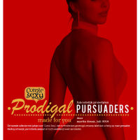
prodigal pursuaders
cover for a booklet with a concept for a new collection for Comic Sexy. Unfortunately we were commercially too small to continue.
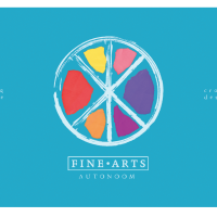
AKI presentation
Presentation for the head of Fine Arts’ at AKI, the art school where i used to teach. It’s based on the official identity but less sleek and with a more ‘autonomous’ feel.
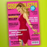
Cosmopolistan
My friend Balder designed the titles for the movie ‘Dunya and Desie’ and asked me to help. The camera would pan and slide over various items that were related to the main characters and hoover over credits. I did a few things more, but the ‘Cosmopolistan’ with Flora Dolores of the Spinshots on the cover was such a funny thing to do that I thought I’d show it here.
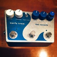
reverb pedal Mischa
Mischa den Haring, the guitarist of T99 builds his own reverb – and other pedals. For this pedal he asked me to come up with a design in exchange for him fixing some broken pedals of mine.


