draax.nl•medium•Graphic design•Logos
- draax.nl•medium•Graphic design•Logos
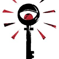
Gunnmol
logo for the rockband Gunnmol – that is, it is supposed to work as a sign for the cult around it.
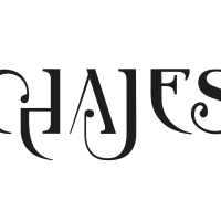
Chajes letter brand
letter brand for Job Chajes, composer
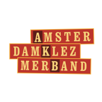
AKB logo
This is the logo for Amsterdam Klezmer Band as an ‘officia identity’ – it’s not the logo you’ll see on record sleeves or teeshirts, but when they do official things -> so it’s on their business paper and so forth.
logo Amsterdam Klezmer Foundation
logo for Amsterdam Klezmer Foundation. It is based on the story of ‘Jacob’s Ladder’ but then with typical Amsterdam style stairs.
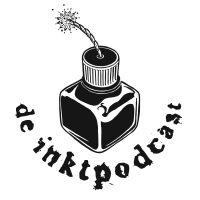
De Inktpodcast
logo for ‘de Inktpodcast’ – a surrealist storytelling podcast by Patrick Bassant.
logo Titia Tijmstra
Logo and lettermark for the copywriter Titia Tijmstra. She wanted something ‘playful’ without being a ‘loudmouth’ and she liked this ambiguous colour. I drew an abstract version of a Fuchsia and used that colour as an accent colour in her graphic identity.
For the lettermark i used the letter font Clarendon Bold and altered the serifs to make it more playful.
The graphics are part of a quirky identity with a drawn portrait on het website.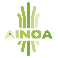
Ainoa 2
AINOA made an interesting career-change. From an AI specialist, she turned into a sculptural artist and decided to organise ceramics workshops in her green and sunny studio. She asked if she could ‘keep the logo’ but i insisted there should be some changes, as it should not look so ‘tech’ anymore, and more ‘natural’. I made minor changes apart from the colour of the logo, and added an icon for socials.
Please Don’t Stop The Music
Logo (and poster) for ‘please Don’t Stop the Music’ – an initiative to help Dutch musicians through the Covid-19 pandemic. You can also visit the site peter Hordijk (who also built this site) and I designed here
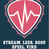
logo don’t stop the music
Logo for ‘Please Don’t Stop The Music’, an initiative to help Dutch music artists through the Corona pandemic. (https://pleasedontstopthemusic.nl/)
De Schlachterij
De Schlachterij was a shop in Heerenveen, Friesland, selling local quality products. I don’t think they made it but nonetheless, logo’s here to stay!
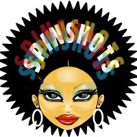
Spinshots mascotte
Mascotte ‘One Hit Wonder’ for the Spinshots
1508 logo
A logo for the record label 1508. This logo has a funny history, it was originally designed to be a music playing app on their site, but the owner of the label, Jan Jaap Snellen, recognised a great logo in the outlines. I thought he was right – and so the outlines of the player became the logo.
See 1508records.nl
By the way, Peter Hordijk, who also built the site you are currently visiting, built that one too!
logo
Logo for the Norwegian band ‘Fint Fransk Orkester’ based on the Norwegian tradition of ‘Rosepainting’ but then in a more French Fin du Siècle style.
logo
For the logo of Laura A Dima’s art project ‘Future Affair’ i looked at Japanese design, vintage ‘future’ typography and i tried to put in something of the ‘electrified feel’ of the installation. The logo was stitched on lab coats that Laura’s assistants wore during the performance.
(the photo on the location is made by Maarten Nauw)
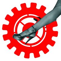
legs and wheel
this is a key image in my identity: being dutch i thought it would be funny if i have this image that resembles ‘biking’ on a bicycle. But it also refers to the skill of driving a one-wheel bike and a knife to cut cardboard with. The legs are owned by fellow artist Sietske who was at the time also a model in her own films. Although two of my characteristics could be ‘images of pretty women’ and ‘work hard’ i use this key image only very small, as a funny detail in my graphic identity at times.
draax logo
So yeah, every now and then i design a logo for myself. Like with most designers, my own identity is more fluid than the one of my clients. it’s fun to do and you can do whatever you want 😉
the turband
When the Spinshots started, they wore turbands. This has a lot to do with my love for Exotica and Bollywood. Traditionally, Sikhs are playing the ‘funny’ roles in Bollywood films and we did not take ourselves too seriously although we made the best music we could. And it looked pretty damn cool, so as an identity item, we had a turband for a logo
paxtrax
logo for the label of Paxy Dragon, one of the bands i was in.
Naked Ears logo
logo for the Amsterdam based band Naked Ears
lola da musica
I only partially deserve credits for this: My friend Rosto and i had this design gig for the TV program and we transformed an anonymous tattoo into this image as we wanted to communicate that pop music was part image and part religion: but definitely worshipping icons.
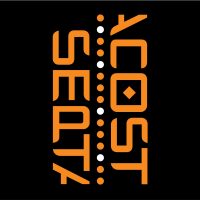
Septacost logo
Logo for the theatre show i scripted for Amsterdam Klezmer Band. The show was about loneliness and how to get rid of it – but the story line was inspired by the James Bond formular. So this logo was projected animating during the ‘title sequence’, part of the elements projected to get the audience into the right mood.
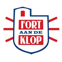
logo Fort aan de Klop
Logo for Fort aan de Klop. They wanted to express the coolness of working with local (Dutch) products (check the colours of the Dutch flag! Who would have ever thought i’d use those! But hey, it’s subtle isn’t it?) and well, they are in this unique place, a sort of mix between a fortress and a bunker.
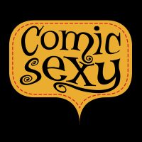
Comic Sexy Logo
logo for Comic Sexy. I wanted the atmosphere of groovy ’60s comics and added the red stitch line to give this ‘hand tailored’ feel.
Floor van Dijck
logo for copy writer Floor van Dijck
klezmer scale
Club Amsterdam Klezmer is a monthly event: Amsterdam Klezmer Band invites a band from abroad and has a jam with them onstage or asks them to do a support show. As a returning object, a logo for the event, i thought it would be nice to have the keys of a piano (or a harmonica) with the notes of the ‘klezmer scale’ pressed.
Every month, i drew another bride for the Amsterdam Klezmer Band. And changed the colours: there were always two dominant colours (in ton sur ton) and red – as a part of the event’s identity.
exotica
With the Spinshots, our music styles varied too much to be easily bookable. We decided to start our own booking agency and this was the logo. i mad this with stuff that i had lying around in the house, i actually have a special room for assemblages and styling objects called ‘the treasure room’ – and this could be made in one day!
key image Septacost
This is the key image of the graphic identity for ‘Septacost’. I tried to depict how one can be lonely in a group. For the poster, i asked star photographer Eddo hartman to photograph the band with a long shutter speed and Alec to stand very still. So the band became a blur, while Alec was sharp. To make a graphic image like this, for teeshirts, stickers, saddle bags and what have you, we also photographed them separate so i could use the silhouettes.
Fryslan
logo indicating ‘Frysian quality’. It could be used three ways, depending on what it needed to be printed on. There was an option with the whole word ‘Fryslan’, or just the A with the bell, or just the bell. I tried to make the physical identity so strong that, had you seen the word version of the logo, you’d recognise it if you saw only the bell.
The bell is borrowed from a frysian phenomenon called a ‘Klokkenstoel’, a tower with a bell made by farmers who were too poor to build a church but need a place for their ceremonies. It therefore has a social connotation and stands for the solidarity amongst the frysians. In the old times, they got the copper bell imported from Amsterdam, so there was also a connection with Amsterdam in this logo, which was something my client Anne Douwe liked very much.
Stardust
There is a story behind this picture. A very long time ago, when i was only just graduated from art school, the director of this program Stardust, asked me to make a logo resembling the ‘Stardust’ logo from Las Vegas. So i designed an alphabet in which the titles of the program were made and this logo, that obviously heavily leans on an original.
Yet there was more: when Ir. Vendermeulen started a club night with the same name they just copied the logo and made this lamp from it. I found out when the lamp was actually in use, never knew they had stolen the design. but honestly, since this the demand of the TV program was almost a copy of the original, i did not care too much.
25 years AKB
Logo for ’25 years of AKB’ – only for big use. i made variations for small use – but personally i like the one with the cirles that become a star most. It’s based on the idea of the rings of a tree: the 7 individuals of the band together make the star, the heart of the band and they exist for 25 years – so there are 25 rings.
Ainoa
Ainoa is an artificial intelligence consultant. It means ‘mother’ in Finnish and sort of spells ‘I Know’. But the meaning is ‘Artificial Intelligence, Not Only Algorithms’. The client wishes to teach companies how to make use of artificial intelligence in an ethically desirable way. With some fantasy, you can see a hand, or a crown above the letters. It seems an artificial hand, though 😉
I also made this illustration for banners on her social media, more to come!


