draax.nl•medium•Graphic design
- draax.nl•medium•Graphic design
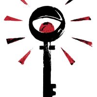
Gunnmol
logo for the rockband Gunnmol – that is, it is supposed to work as a sign for the cult around it.
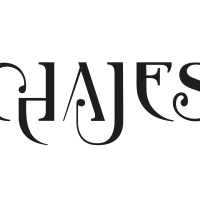
Chajes letter brand
letter brand for Job Chajes, composer
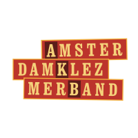
AKB logo
This is the logo for Amsterdam Klezmer Band as an ‘officia identity’ – it’s not the logo you’ll see on record sleeves or teeshirts, but when they do official things -> so it’s on their business paper and so forth.

logo Amsterdam Klezmer Foundation
logo for Amsterdam Klezmer Foundation. It is based on the story of ‘Jacob’s Ladder’ but then with typical Amsterdam style stairs.
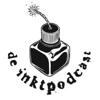
De Inktpodcast
logo for ‘de Inktpodcast’ – a surrealist storytelling podcast by Patrick Bassant.

logo Titia Tijmstra
Logo and lettermark for the copywriter Titia Tijmstra. She wanted something ‘playful’ without being a ‘loudmouth’ and she liked this ambiguous colour. I drew an abstract version of a Fuchsia and used that colour as an accent colour in her graphic identity.
For the lettermark i used the letter font Clarendon Bold and altered the serifs to make it more playful.
The graphics are part of a quirky identity with a drawn portrait on het website.
Ainoa 2
AINOA made an interesting career-change. From an AI specialist, she turned into a sculptural artist and decided to organise ceramics workshops in her green and sunny studio. She asked if she could ‘keep the logo’ but i insisted there should be some changes, as it should not look so ‘tech’ anymore, and more ‘natural’. I made minor changes apart from the colour of the logo, and added an icon for socials.
Please Don’t Stop The Music
Logo (and poster) for ‘please Don’t Stop the Music’ – an initiative to help Dutch musicians through the Covid-19 pandemic. You can also visit the site peter Hordijk (who also built this site) and I designed here
logo don’t stop the music
Logo for ‘Please Don’t Stop The Music’, an initiative to help Dutch music artists through the Corona pandemic. (https://pleasedontstopthemusic.nl/)
De Schlachterij
De Schlachterij was a shop in Heerenveen, Friesland, selling local quality products. I don’t think they made it but nonetheless, logo’s here to stay!
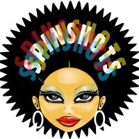
Spinshots mascotte
Mascotte ‘One Hit Wonder’ for the Spinshots

1508 logo
A logo for the record label 1508. This logo has a funny history, it was originally designed to be a music playing app on their site, but the owner of the label, Jan Jaap Snellen, recognised a great logo in the outlines. I thought he was right – and so the outlines of the player became the logo.
See 1508records.nl
By the way, Peter Hordijk, who also built the site you are currently visiting, built that one too!

logo
Logo for the Norwegian band ‘Fint Fransk Orkester’ based on the Norwegian tradition of ‘Rosepainting’ but then in a more French Fin du Siècle style.
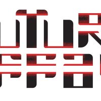
logo
For the logo of Laura A Dima’s art project ‘Future Affair’ i looked at Japanese design, vintage ‘future’ typography and i tried to put in something of the ‘electrified feel’ of the installation. The logo was stitched on lab coats that Laura’s assistants wore during the performance.
(the photo on the location is made by Maarten Nauw)

legs and wheel
this is a key image in my identity: being dutch i thought it would be funny if i have this image that resembles ‘biking’ on a bicycle. But it also refers to the skill of driving a one-wheel bike and a knife to cut cardboard with. The legs are owned by fellow artist Sietske who was at the time also a model in her own films. Although two of my characteristics could be ‘images of pretty women’ and ‘work hard’ i use this key image only very small, as a funny detail in my graphic identity at times.
draax logo
So yeah, every now and then i design a logo for myself. Like with most designers, my own identity is more fluid than the one of my clients. it’s fun to do and you can do whatever you want 😉

the turband
When the Spinshots started, they wore turbands. This has a lot to do with my love for Exotica and Bollywood. Traditionally, Sikhs are playing the ‘funny’ roles in Bollywood films and we did not take ourselves too seriously although we made the best music we could. And it looked pretty damn cool, so as an identity item, we had a turband for a logo
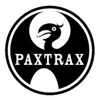
paxtrax
logo for the label of Paxy Dragon, one of the bands i was in.
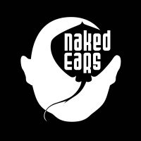
Naked Ears logo
logo for the Amsterdam based band Naked Ears
lola da musica
I only partially deserve credits for this: My friend Rosto and i had this design gig for the TV program and we transformed an anonymous tattoo into this image as we wanted to communicate that pop music was part image and part religion: but definitely worshipping icons.
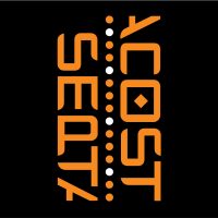
Septacost logo
Logo for the theatre show i scripted for Amsterdam Klezmer Band. The show was about loneliness and how to get rid of it – but the story line was inspired by the James Bond formular. So this logo was projected animating during the ‘title sequence’, part of the elements projected to get the audience into the right mood.
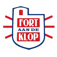
logo Fort aan de Klop
Logo for Fort aan de Klop. They wanted to express the coolness of working with local (Dutch) products (check the colours of the Dutch flag! Who would have ever thought i’d use those! But hey, it’s subtle isn’t it?) and well, they are in this unique place, a sort of mix between a fortress and a bunker.
klezmer scale
Club Amsterdam Klezmer is a monthly event: Amsterdam Klezmer Band invites a band from abroad and has a jam with them onstage or asks them to do a support show. As a returning object, a logo for the event, i thought it would be nice to have the keys of a piano (or a harmonica) with the notes of the ‘klezmer scale’ pressed.
Every month, i drew another bride for the Amsterdam Klezmer Band. And changed the colours: there were always two dominant colours (in ton sur ton) and red – as a part of the event’s identity.
exotica
With the Spinshots, our music styles varied too much to be easily bookable. We decided to start our own booking agency and this was the logo. i mad this with stuff that i had lying around in the house, i actually have a special room for assemblages and styling objects called ‘the treasure room’ – and this could be made in one day!
key image Septacost
This is the key image of the graphic identity for ‘Septacost’. I tried to depict how one can be lonely in a group. For the poster, i asked star photographer Eddo hartman to photograph the band with a long shutter speed and Alec to stand very still. So the band became a blur, while Alec was sharp. To make a graphic image like this, for teeshirts, stickers, saddle bags and what have you, we also photographed them separate so i could use the silhouettes.
Fryslan
logo indicating ‘Frysian quality’. It could be used three ways, depending on what it needed to be printed on. There was an option with the whole word ‘Fryslan’, or just the A with the bell, or just the bell. I tried to make the physical identity so strong that, had you seen the word version of the logo, you’d recognise it if you saw only the bell.
The bell is borrowed from a frysian phenomenon called a ‘Klokkenstoel’, a tower with a bell made by farmers who were too poor to build a church but need a place for their ceremonies. It therefore has a social connotation and stands for the solidarity amongst the frysians. In the old times, they got the copper bell imported from Amsterdam, so there was also a connection with Amsterdam in this logo, which was something my client Anne Douwe liked very much.
Stardust
There is a story behind this picture. A very long time ago, when i was only just graduated from art school, the director of this program Stardust, asked me to make a logo resembling the ‘Stardust’ logo from Las Vegas. So i designed an alphabet in which the titles of the program were made and this logo, that obviously heavily leans on an original.
Yet there was more: when Ir. Vendermeulen started a club night with the same name they just copied the logo and made this lamp from it. I found out when the lamp was actually in use, never knew they had stolen the design. but honestly, since this the demand of the TV program was almost a copy of the original, i did not care too much.
25 years AKB
Logo for ’25 years of AKB’ – only for big use. i made variations for small use – but personally i like the one with the cirles that become a star most. It’s based on the idea of the rings of a tree: the 7 individuals of the band together make the star, the heart of the band and they exist for 25 years – so there are 25 rings.
Ainoa
Ainoa is an artificial intelligence consultant. It means ‘mother’ in Finnish and sort of spells ‘I Know’. But the meaning is ‘Artificial Intelligence, Not Only Algorithms’. The client wishes to teach companies how to make use of artificial intelligence in an ethically desirable way. With some fantasy, you can see a hand, or a crown above the letters. It seems an artificial hand, though 😉
I also made this illustration for banners on her social media, more to come!
Bomba Pop Album design
‘Bomba Pop’ is the name of the 2024 album by Amsterdam Klezmer Band. We came up with the name after a brainstorm with Gijs (Trumpet) and Jasper (Bass) in which they explained that they had to break a lot of their material to pieces, in order to get this progressive, new sound. We decided the album was about breaking that what you love, in order to become better.
So i translated that into the Greek / Etrusk habit to paint their heroes on vases: everyday (breakable) objects used as canvases for art and storytelling. Not unlike an LP, I thought. So the imagery is based on Greek mythology and the popular outlook of Greek ancient art, but with new imagery. On the cover we see a modern day Hercules with a lion. Has he tamed the lion? Are they friends? Is this a ritual before a fight? In the back we see the city wall of Hamburg, since this album is produced by Dunkelbunt, who is from there.
We also felt an urge to communicate through the imagery the main focus of the band: to connect people of all backgrounds. This album came out in a heavy time and the band wanted to communicate (although not too obvious) that they were above tribalism: they’d connect everybody. They make people feel good. Hence the dove: the album came out in 2024, after all.
The photo of the band is made by René Nuijgen.
On Mala
‘BOn Mala’ is an album by Amsterdam Klezmer band, released in 1023. I was asked to design the identity for that period: the album, the singles, the posters and the visual concepts. This cover is of one of the singles, and has the name ‘On Mala’.
‘On Mala’ tells the story of a man going to war after being promised a Lada by his government. He gets back from the war missing a leg and therefore can’t use the acceleration pedal of his new car.
The identity concept boils down to ‘to break what you love in order to make it better’. The images on the covers and posters are inspired by the ancient Greek and Etrusk vases. Everyday (but breakable) objects depicting heroes and their actions. I replaced ‘vases’ by ‘albums’ and ‘singles’ and made an iconography inspired by Greek mythology but linked to the songs by Amsterdam Klezmer Band.
We see a guy driving a Lada with a leg on the roof of his car. The arrow indicates it’s Achilles’ leg, so the guy driving the car must be Paris – who apparrently also was given a Lada by his government.
Bomba
‘Bomba Pop’ is an album by Amsterdam Klezmer band, released in 1023. I was asked to design the identity for that period: the album, the singles, the posters and the visual concepts. This cover is of one of the singles, and has the name ‘Bomba’.
‘Bomba’ tells the story of a man lusting for a woman who later ruins his life.
The identity concept boils down to ‘to break what you love in order to make it better’. The images on the covers and posters are inspired by the ancient Greek and Etrusk vases. Everyday (but breakable) objects depicting heroes and their actions. I replaced ‘vases’ by ‘albums’ and ‘singles’ and made an iconography inspired by Greek mythology but linked to the songs by Amsterdam Klezmer Band.
So here we see a girl based on Helen of Troy acting as a femme fatale riding a rocking horse full of wine at a wild party – fitting the atmosphere of the music. The fun is dat this kind of icons are very good for minimal animation: for the promotion i made a moving version as a gif and as a printed lenticular card.
Joop van der Linden
Joop van der Linden is known mostly as the trombonist of Amsterdam Klezmer Band. But he asked me to do the design for this experimental solo album he wrote and produced. I had his music generated to image through After Effects and turned separate stills into a new image, combined with hand coloured typography.
Two Dreams at the Same Time cover
Two Dreams at the Same Time is a Draax original sung by Rosie Stevens. Although i had the idea to make a cover with images subtracted from the videoclip i made for the song, the communication agent i asked to help me spread the word during the launch period said i should turn the singer into a comic version of herself. I listened to his advise and this is the result.
Tournée Générale album art
Tournée Générale is the second album of Fint Fransk Orkester. I had the honour to do the design this new album and periodical identity and drew them in a sort of impressionist style playing in an art nouveau kind of club. I like it that there is am anomaly here since Impressionism was earlier than Art Nouveau, but it all refers to their music, trust me.
Hidden Tracks
‘Hidden Tracks’ is an AKB compilation of tracks that were never published before: demos, rehearsals, tracks that did not make it. It came out on cassette in 2022 and I did the design for all parts in it.
I made a little soft fabric pillow cover so that you could take the boys to bed, a lenticular postcard, stickers, and other designs. Note the golden cassette! The photo on the cassette cover is made by Tessa Posthuma de Boer.
Balkan Dinosaur / Line of Life
Cover for the EP ‘Balkan Dinosaur / Line of Life’ by the Spinshots. Part of the EP series ‘Seven Bullits, One Gun’: The Spinshots brought out this series over their last year of existence but never quite finished it. The idea was that the album was a ‘Whodunit’: it tells the tale of a murdered young woman and listeners can guess who the killer is by following cues from lyrics and design.
West Hell Five
Artwork for West Hell Five, an Amsterdam based spy fi jazz combo. The photo is made by Mirte Ter Maten and to keep it real, the title is, James Bond style, projected on the girl. No photoshop here peeps. (well the photographer obviously did some colour correction)
Inside was a gigantic poster of the lady with the gun. On the back side of that poster we see a spy fi novel drummer Wilf Plum wrote on pages ripped from a book. The book has a hole in the middle hiding a gun.
Désirs Mutuèls
the Désirs Mutuels single came out as a dvd with a videoclip. For the clip, we went into an abandoned warehouse with a working elevator. This was all done ‘no-budget’ and the cover art was silk printed by hand on the cheapest DVD packages we could get our hands on. Still love the song, the clip and the package art, though.
Y
‘Y’ came out on casette – as the 2nd cassette album by the band. The first one was ‘As Experienced on the Famous Last Breath Show’ but I can’t find that one any more.
In that time (early 90s) I was reading a lot about alchemy. So kings, queens, sulphur, crimson, dragons, boiling pots – all found a way into my work. Fortunately, I had a sense of humor so the depicted phenomenon of ‘killing the dragon’ did not work out too pretentious. I think.
The ‘Daily Drag’ was a newspaper from the island on which the band resided: Oaxakaah. In there was gossip and the lyrics.
Blue For The Occasion
‘Blue for the Occasion’ is Paxy Dragon’s third CD album. (hey guys, those were the ’90s!)
I hope to find back some pictures of that time, I might post it in the ‘behind the scenes’ section of this work. My Friend Vi made it to the cover and to the teeshirts. Must have one of those somewhere to…Gainsnord
Gainsnord is an initiative of the Dutch DJ Guuzbourg, who coined the term ‘Zuchtmeisjes’. He asked several Dutch bands to make a cover of a Gainsbourg song – the Spinshots chose ‘Qui Est ‘In’, Qui est ‘Out’, which became the single of the album.
For this record i had the honour to work with Dutch well known comic artist Hanco Kolk, who made the beautiful portait of Serge for the cover.
demos
Cover for the bandcamp album ‘Demos’.
This is actually a drawing I made for my first website – everything in flash, full of animation. That side was like a game: you were in space with the Designdevil (me) and you certainly would get lost. But now I could use this specific picture for the albumcover – demos of songs from the ole’ days.kathy
‘Kathy was Paxy Dragon’s first CD album. Kathy was a Paxy Dragon’s song, written by Roelof de Groot, that was very popular amongst fans. Wherever we used to play people in the audience would shout for ‘Kathy’, so it became a running gag to play it late in the set..
The song is not on the album, so it ends with a fan shouting ‘Kathy!’ after the last track.
The cover illustration is made by Ingrid Bockting.
Y
Paxy Dragon’s ‘Y’ was a cassette album, recorded on Roelof’s or my 4-track. For this album, I designed a letter font and we developed a language, including native signs… making it impossible to read the credits.
With the cassette came the ‘Daily Drag’ – the International Newspaper written in English so people could understand a bit what we were all about.
Omnes Tredecim Boni
‘Omnes Tredecim Boni’ is the title of a Paxy Dragon album in which they sing about rituals and habits of their island. The title is a bit of a practical joke: the band was judged as ‘pretentious’ regularly so they made up a latin sounding title that translates to ‘All 13 Great’ – referring to the 13 songs on the album. In the Netherlands, it used to be common that you could buy ‘All 13 Great’, of ‘All 13 Hits’ albums on which the masses’ favourite tunes were covered by anonymous bands. Usually, these tracks were lame.
Since CD’s usually are so ugly, i thought it would be great to print the transparant plastic as part of the design to go with the paper behind it.
gainsnorth
When Guuzbourg asked the Spinshots to contribute a song to the cover-album ‘Gainshorth’, a tribute to Serge Gainsbourg, he also asked me to do the design for the records. That is, our single and the album itself. He already asked Hanco Kolk for the artwork, so I could work with one of the greatest comic artists the Netherlands have to offer.
seven bullets, one gun -EP series
‘Seven Bullets, One Gun’ was an EP series by the Spinshots. The idea was that we made a ‘Whodunit’ over 7 vinyl singles. Clues about the murder of a Romanian runaway girl were given in the texts and the covers.
Note: the drawings on the first two covers were made by Emanuel Wiemans, the drawings on the last two covers were made by me.
désirs mutuèls
Désirs Mutuèls was a song I wrote for Paxy Dragon, although originally it was in English and had the name ‘Mutual Desires’.
When I started the Spinshots, it seemed a nice idea to make a completely different version, and the drummer came with the idea to translate it to French (done so by Natasha Cloutier) to give it a more ‘exotic’ feel. We recorded a videoclip that came out as a single, and I silk printed this cover for it.
qui est ‘in’, qui est ‘out’
We were asked by dj Guuzbourg to make a cover of Serge Gainsbourg’s ‘Qui est ‘In’, Qui est ‘out’, for a compilation of Dutch bands paying hommage to the French songwriter.
It was nice to know that Charlotte agreed on our version. The song came out with different covers, the futured image is an online version.The other images are the cover and the label of the vinyl single, which we shared with fellow Amsterdam band Juicebox, who covered ‘Chatterton’. The cover image was drawn by Hanco Kolk, which is a Dutch Comic Artist I admire very much, so it was flattering to have his work on our cover.
smiths of rhythm & tunes
One of the nicest ways to describe our music was, if you ask me, ‘Rhythm & Tunes’. I wrote a song called ‘The Smiths of Rhythm & Tunes’ as a bit of a joke: since we wore turbans at the time because I am a huge exotica fan, I thought it would be funny if we our own ‘Sultans of Swing’.
We had some changes in the personnel at that time – hence different covers. It was re-released as ‘Cleans-0-tech’ which was a song that sounded like a commercial break in the set.
fint fransk orkester sleeve
The Norwegian Francophile combo ‘Fint Fransk Orkester’ asked me to do a sleeve in ‘Paris Fin de Siècle’ style. Well – I am a great fan of the art made in that period so I loved doing that. I designed their lyrics as an 1900’s paper magazine, the cover has an extra layer of gold and for the caricatures i had a good look at my hero de Toulouse-Lautrec. The poster was also printed as a give-away and bag for fans.
music for fingers
The artwork you see on the cover of this album is ‘The Finger Rub Rug’, made by my girlfriend Laura A Dima. It consists of 1300 replica’s of my fingers and are placed as a ‘single bed’ in a designated white room. Under the mat that hosts the fingers is a warming element and a haptic speaker giving the work a heartbeat.
Laura asked me to compose music to experience the artwork with and we decided on a quadrophonic piece with 4 elements coming from four speakers. So although one side was more scary, another more humorous, the others more ‘erotic’ and ‘exotic’, together they’d make one composition, fitting to the heartbeat.
People who dared to lie down on the Finger Rub Rug, would feel an extra heartbeat in their chest, warmth coming from the fingers and hear the ‘exotica’ soundtrack from 4 directions. One of the (many) good aspects of this artwork is that you were in this room on your own, which gave a completely different dynamic than being alone in, say, your living room. This was a very good way to contemplate and reflect on things.
So since ‘Music for Fingers’ is an album having the full composition brought back to stereo and 7 outtakes, using a photo of the artwork seemed to provide the best cover.
this time no lies
Blues singer Boyd Small asked me to do his cover art. I asked photographer Susan ArbabZadeh to make this picture in the cafe we frequently visited: ‘De Diepte’. The owner was kind enough to give us the keys and let us make these pictures here. I asked Boyd to write some lyric on a beermat, as if he was writing them in the bar and this picture started the practical joke of never showing his face on his covers.
oy oy oy
Amsterdam Klezmer Band made an album that showed their extremes, and I thought it would be great if I could put something of that in the design of the cover. So I made an illustration that changes according to the light situation it is seen in: in the dark we see another image than in the light – representing our duality: what do we show and what do we hide, that only comes out ‘in the dark’?
mokum
‘Mokum’ was the first album I did for Amsterdam Klezmer Band. They wanted to give their fans a present and explained to me that although they were called the ‘Amsterdam Klezmer Band’ not everybody considers them to be ‘Klezmer’. They aim for the genre to be alive, and therefor mix it with other types of music and so I thought of this ‘devil in a box’ cover.
I asked them to give me their back stage passes from over the years to make a chain for the little devil and i used more of those on the inside design. I have to say i really like it that purists don’t find them ‘Klezmer’ enough – they are very interesting musicians and very interesting individuals as well. I feel lucky I was asked for all their covers ever after this little devil.
fortuna
‘Fortuna’ was for emotional reasons a very special album for AKB, but the music also seemed to beam more reflection. I thought I’d make this esoteric looking cover and asked Krijger Vormgave to silk print black paper it using reflective inks that change impression, depending on how you hold the cover in your hands. Also, the inks work like the colours of light: topping ink on ink does not ‘add’ to a darker colour, but ‘subtracts’ to a lighter colour. This was an attempt to capture the unpredictable way the music on the album was created.
blitzmash
‘Blitzmash’ was an AKB record in which the band experimented with drums, beats and instruments that would not classify as ‘Klezmer’. I thought of a practical joke, using a ‘bellydancer’ for the cover art. On the CD we had an extra future: the dancer would be moving when the CD was pushed out of the sleeve.
Benja
Amsterdam Klezmer Band developed ‘Benja’ with Dick hauser. They asked me to do the poster, recordcover and stuff. I asked photographer Fred van Diem to make a picture of a bride and used that photo as a reference for this drawing. This was the starting point of all publicity material and the cover.
nasmak sleeve
Nasmak was a band that made lots of demo tapes on cassettes somewhere in the 80s. When they brought out these tapes in 2019 (!) Joop van Brakel asked me to do the sleeve design. I loved what they made and did the design like i would have done in the 80s: with a typewriter, punaises and glue. The cover is just a photo, everything is really glued and pricked there.
The cover illustration with the meat flag is made by the illustrious band member Joop van Brakel, in co-operation with Rembrandt.
never so right
Never So Right is the first (and only) LP recorded by the Spinshots. I wanted the cover to look like one of those albums with a great cover and shitty music on it, as a practical joke. We asked photographer FotoFloor and stylist Iris Satijn to help us with the cover image. Emanuel Wiemans helped me with the handwritten typography and on the inside you see the musicians of the band in a toy rikshaw. This all should represent the serious-but-not-serious outlook of the Spinshots.
amsterdam beat club 10 years anniversary album
Amsterdam Beat Club is an event organised by Ir. Vendermeulen, in effect the ‘Night Major’ of the Amsterdam I Love. His events are 50’s and 60’s inspired dance evenings with bands and acts. When he brought out a compilation album with bands that played on his events, he asked me to do the art direction and graphic design. The photo’s are taken by Myrthe Ter Mate and the models are dancers of Amsterdam Beat Club
Club Amsterdam Klezmer posters 2022 – 2023
Posters i drew and designed for CLub Amsterdam Klezmer.
On irregular intervals, Amsterdam Klezmer Band hosts an event inviting a band from somewhere in Europe to jam on stage. Since the bands often are Eastern Europe Roots bands, i thought it would be good to show a traditional bride from the area the guest musicians came from. As if AKB has a one day marriage with different cultures every now and then.
Under the clothes i draw for every event, is the same girl, a muse if you will. By changing the colours and the outfit, i created a strong identity for the event, looking different every time.
Club Amsterdam Klezmer / Klezmer Lab
Posters for ‘Amsterdam Klezmer Lab’ and ‘Club Amsterdam Klezmer’.
Amsterdam Klezmer Band organised two series of events. The ‘labs’ were experimental events with renowned guest artists, and the ‘Club’ events were also with guests, but the emphasis would be on making people dance.I translated that into an iconography in which the ‘Club’ brought things together: we see different circles merging their colours, whereas the ‘Lab’ is the ‘exploding’ version of that idea. (the association with an explosion in an experimental lab was too funny not to use)
Please Don’t Stop The Music poster
Poster (and logo) for Please Don’t Stop The Music, an initiative by Andries van Wieren, to help Dutch music acts through the Covid-19 period. Peter Hordijk (who also built this site) and I worked overnight to launch the site just the morning after we got the assignment.
Don’t Stop The Music
Poster for ‘Don’t Stop The Music’, an initiatief by Andries van Wieren and 3S music to help Dutch bands and music artists in times of the Corona pandemic.
‘Don’t stop the Music’ is a site where you can hear Dutch artists, listen to their music, buy their records and services, mostly as music teachers or coaches. It had to be realised over night, and Peter Hordijk, who built the site (and this site, too) and i had to work pretty hard. But with effect, i like to think!
maghreb and mediene
However much i love to design posters, this kind is the kind i usually try to void: people give me a photo and say ‘we want a poster, can you take this picture and make a poster with it?’ – For everyone who reads this: the more free you set your designer, the better the result! I try to find out how to communicate your story in one image and that doesn’t always means you need to show a picture of your band. BUT in the end, after the colouring and the nice typography i actually was happy with it so i am showing it here.
If you plan on hiring me as your poster designer, be sure to present your request without having design ideas though: in the end, that’s what you employ me for.
tour poster
For their tour celebrating 25 years of the band, i got a promotion photo to work with. It was a bit hard for me because usually i design from scratch and if needed, ask a photographer to picture something specific. But the photographer was smart and left a big playfield open for typography and the graphic i designed: 25 rings meaning 25 years, a circle being a star at hart symbolising the synergy of 7 individuals coming together in a band. I also loved it that we could keep it very basic: hold your phone close to the code and book a ticket – that is about all information!
Because they look a bit like people from bygone times i thought the typography should also resemble 1921, rather than 2021. The whole thing fits their music well: traditional and contemporary at the same time.
The photo is made by Tessa Posthuma de Boer.
posters
The poster for Future Affair was tricky. The work, as designed by Laura A Dima, provides a very strong image, yet we did not want to give that away. We needed a poster as a window to the content and advertising the experience, but if we would show how Laura would do that through her artwork, we felt we were downgrading the work. So i designed something with an illustration, almost an infographic about physical ‘touch’ (of the hand) being wired from one capsule to another.
The artwork explained in short: a luring sculpture in one hub wires data to the other hub when touched. In the other hub, a machine is triggered to caress the visitor sitting there through a machine. This project caught the attention of the Technical University as well as social scientists as you don’t see who you are caressing. The artwork brings ‘communication’ to a basic level, a level we feel all comfortable with – yet we do things we would not do if we would have seen the other person.
Septacost
Poster for Septacost, a music theatre show by Amsterdam Klezmer Band. I had the honour to write the script and do the direction of the first version, i designed the stage, did the art direction and of course designed the posters.
In the tradition of Saul Bass, i try to communicate the concept of a whole show in one single and simple image. So i thought the content boiled down to ‘you can be lonely in a group’ and came up with this simple idea; the whole group moves during the photoshoot except for singer Alec, he has to stand really still. This way we see a distinction between him and the group he has been touring with for then twenty years. The photo is (brilliantly) made by Eddo Hartmann, check him out – this man is amazing!
Kali Maya
Poster (autonomous work) with Kali – stating ‘Nothing lasts Forever’. I called this poster ‘Kali Maya because Maya posed for it and ‘Maya’ means the ‘veil between us and reality’. The poster is silk printed by hand in 5 colours and is 1.20 cm high.
If you want to buy a print (there are two left) mail me!
heden Stad
Poster for Hotel Modern. I wanted to emphasise the loneliness one can have living in a city: the feeling that ‘much is happening, but you’re not part of it’ can be heavy, especially for young people. So i asked photographer Tza Tza to make these pictures of the actors and i ripped the prints into this poster.
club tour poster
Poster for Amsterdam Klezmer Band during their ‘Fortuna’ tour. I tried to catch the somewhat ‘esoteric’ feel of the material on this album – there was a lot of reflection going on in the band, at that time. AKB are very integer with their music and i think on this album they made quite a break though reaching deeper layers that are audible in the music.
Club Amsterdam Klezmer
Club Amsterdam Klezmer is a monthly event organised by Amsterdam Klezmer Band. The band invites other bands or acts and james with them. Sometimes the guests are the support act, sometimes AKB is the support act. But most of the time they are together on stage.
I was asked to create a poster with a clear identity, for a new bill every month. I thought it would be great to give AKB ‘a new bride’ every time, so i drew a girl in a position that would return on every poster, but every time she’d wear the bridal attire of the country where this month’s guests were from. By choosing a strict and simple colour scheme algorithm, the identity was strong and there was enough variety to keep the poster interesting on the street
Benja
Poster for Benja. Benja was a music theatre show by Amsterdam Klezmer Band, directed by Dick Hauser. For this poster we asked Fred van Diemen to make a photo of a girl in bride’s attire playing the harmonica – representing the girl in the piece. The other illustrations lean heavily on Saul bass’ style, who is a designer i off course deeply appreciate.
Wijze Lessen
This is a silk printed design; in fact, not a poster but the world’s biggest business card. i made it for a philosopher who brought talents together.
‘Je moet niet denken dat een ander denkt zoals jij denkt’ means ‘you should not think someone else thinks the way you do’, and ‘Wijze Lessen’ means ‘Wise Lessons’ (if this is even English). I thought my client was a person crying in the wilderness: loud, with good ideas but unheard by policy makers. So i made a huge business card for him: it is one meter high and about 65 cm wide.
Rhythm & Tunes
Hand silk printed poster for the Spinshots featuring new singer Flora Dolores. I have always liked the term ‘Rhythm & Tunes’ to explain ‘what kind of music i make’.
Later we tagged in ‘Neo Exotica’ but i never really liked that denotation – it feels restricting to have a genre that seems too framed. But yeah, bookers want to know what they book.Anyway, here is a poster for a band that really is inspired by the ’50s and ’60s exotica wave but mixed it with punk, beat and soul. Beat, not Beats.
akb 15 jaar
This was part of my first assignment for Amsterdam Klezmer Band, They were together and on the road for 15 years and wanted to give their fans a present. So they recorded live versions of the songs they voted to like most and i designed a key image, the album and the posters. i asked them for the stage passes they had saved up in a big pot over the years and used that as a necklace for the devil jumping from the box. There are some secrets hidden in the design, so i wont tell them here.
West Hell Five poster
Poster for the Amsterdam based spy fi band ‘West Hell Five. The photo was made by Myrthe ter Maten, the model is Marieke Bos. The typography is projected on the model so i had this sketched out very carefully and the model had muscle strains the next day. It never ceases to amaze me how unnatural models must bend their bodies to occur natural on photos.
on the back site of the poster is a novelle written by drummer Wilf Plum. I did the typography of the story on seemingly torn pages from a book with a hole in it to hide a gun.
Metamorfose posters
a poster and a business card – Metamorfose was a show where you’d walk in as one person and out as a brand new person. Stylists were ready to give you a more glamorous look and you could buy the while outfit if you liked it. The whole thing was quite ‘Boho’ – so not so much my style but i think I got the best of both worlds!
We’ve Got Soul
‘We’ve Got Soul’ was a dance performance choreographed by Maggie Boogaard, who run the company called ‘Dragon Productions’. I had the pleasure to do all her posters when she was still living in the Netherlands (she moved to Paris and opened a dance school).
This is the poster for her show We’ve Got Soul’
T I M poster
The Identity Machinery is an art project in collaboration with my partner Laura A Dima. We bring to life a person suffering from a Multiple Reality Disorder. But maybe it is just a story about the possibility of multiple realities.
On this poster, you see the characters in something that seems a mix between a lab, a church, a prostitute’s street, a strip show and a jail. Note that the typography consists of particle hexagons.
business card
Business card for ‘Metamorfose’ – a shop in which you’d become a brand new version of yourself. Not any longer would you be just somebody of anybody, but you’d be a glamorous version of your self, not hiding as a silhouette in the dark. Out in the light and show yourself! That was the idea behind the identity.
Draax graphic identity (before 2021)
At some point, I needed an identity too. But until 2021 I had various business cards, promotion cards, flyers with all too many ideas. Sometimes they were promoting my graphic design skills, sometimes my autonomous art practice. Sometimes it was about music or video and in 2021 I decided to just be a ‘multipunk artist’. I made a final identity that is flexible enough to host all my incarnations. Like the site you’re on now.
But here you can see earlier business cards, web design, and what have you? Just stuff that is nice to look at but not in use any longer.
identity Fort aan de Klop
For the family event playground ‘Fort aan de Klop’ in Utrecht, i developed an identity that now is in use for more than 15 years. They sort of specialise in ‘good local food’ and a friendly, non-city like environment in the midst of the city. Frequently, there are bands and theatre groups playing, and they organise festivals.
i designed their logo and graphic identity.
magazines in Deep Shit
When the devil sings his song to lure them into selling their soul, the musicians in ‘Deep Shit’ get to see a few magazines in which they will be featured once they are famous. Of course, those magazines had to be designed, even though you could only see them for less than half a second. But here are the spreads you see in the movie, if you don’t blink your eyes.
covers
Housekrant was a magazine for young people in the Netherlands who grew up without their parents. These were kids in foster homes, refugees, jailed people – not a particular kind of parentless kid, but all of them. Due to the cuts it had to stop, unfortunately. I had the pleasure of doing the art direction and graphic design for it. Every month I asked another illustrator for the cover and sometimes i did the illustration myself. Here are some covers i drew.
ons terras is open
When the Dutch Government decided to loosen up the Corona rules a bit, Fort aan de Klop had to communicate that their terrace was open, as long as guests sat one and a half meter apart. I designed this banner (it’s 3 meters wide) for their garden – people could see this when they had a stroll in the neighbourhood.
Note that the waiter is the same guy as the director of the circus presented at the festival ‘Kermis de Klop’ – we made a character out of him that returns on several occasions.
Boogaloo Rumble
Ivan Marien and I have been organising ‘Boogaloo Rumble’ for years, I think we do it about 7 or 8 years now. But due to the Corona crisis this did not happen for a while. Boogaloo rumble is an event at De Nieuwe Anita in Amsterdam: basically we play 50sm 60s and 70s vinyl and have an act. This can be a band to dance to, or dance lessons. Sometimes we did a ‘Bollywood Special’ and had the dancers of Bollywood Amsterdam over.
Every month Ivan and I designed a new flyer. I’ll post some of them here.
promotion shards
Since the concept op the album ‘Bomba Pop’ is ‘breaking what you love to become better’ we had the band dancing on plates and cups, breaking the stuff while doing a wild Sirtaki. Photographer René Nuijens found a perfect location for the publicity photo and we gathered the shards to make businesscards to promote the album on music professionals fairs.
click here for the album design and the identity images of the singles
graphic design in BB goes to A
Baby Boom is outside a lot in ‘Baby Boom in Amsterdam’ (working title)
Since the story we follow is actually a ‘Red Herring’ to the real story that is told by the surrounding characters and th surrounding itself, the graphic design of the posters, interfaces, stickers and logos play a big role. But these are always very small sized since they are in the background. Here you can look and laugh at some of these designs.routing the mind
Inside the 10 floor high building of Rabobank Heerenveen, i designed an ‘alternative routing’ – or perhaps it should be called ‘a routing for the mind’ connecting the content of the departments with quotes from historic people. It looked a bit like a tube way map, but with quotes where the stations would be.
Words that are there in a bigger font, are the breaking point of a sentence – and by giving it two colours i added meaning to each word. ‘Volgende’ is Dutch for ‘Next’ but if you use only the part that says ‘volg’ it means ‘to follow’. This way i tried an audience to not take the quotes for granted. For instance the quote ‘Succes is the skill to move from one failure to the next without loosing enthusiasm’ is supposed to come from Churchill, who was a war minister. Playing with the words like i seems to also makes him say ‘follow me’. Kohl’s ‘Visionaries are tomorrows realists’ gets a special emphasis on the part ‘listen’ in ‘realisten’. All was ment to keep the workers at Rabobank ‘modest’ as they were taking care of other people’s money. The modesty idea was Anne Douwe Knobbe’s, my client. Honestly, i think he was quite visionary himself.
At the end of the lines you see parts of quotes that are in complete lay out on other floors, but have a connection with the quote you can read.
Cosmopolistan
My friend Balder designed the titles for the movie ‘Dunya and Desie’ and asked me to help. The camera would pan and slide over various items that were related to the main characters and hoover over credits. I did a few things more, but the ‘Cosmopolistan’ with Flora Dolores of the Spinshots on the cover was such a funny thing to do that I thought I’d show it here.


